
Mobile UX Case Study
BACKGROUND - Blenddy Herbal Dosage Tracker and Insight Tool
Seeing unmet needs in the fledgling cannabis industry, I founded Blenddy to pioneer tailored consumer solutions for this complex space. As founder and lead designer on Blenddy, I led creation of a robust platform connecting consumers and businesses through a seamless service ecosystem. Far beyond a single app, Blenddy incorporated companion devices, user/business dashboards, advertising, and data analytics. We built this from 0 to 1 to n, providing comprehensive solutions addressing unmet needs for the emerging cannabis space, building an active user base of 25K+ subscribers.
CHALLENGE
My multifaceted responsibilities spanned strategic, creative, technical, and marketing across a seven-person team. Balancing UX research, interviews, design, data visualization, team leadership, fundraising, and regulatory analysis to create a marketing channel adaptable to evolving legal and ecommerce landscapes.
THIS CASE STUDY CAPTURES KEY MOMENTS FROM BEGINNING TO END, DIRTY SKETCHES AND ALL…

Product Overview:
Blenddy tackled the intricacies of a complex emerging industry with stringent regulatory guardrails. by building a solution with perpetual design flexibility. Our innovative solutions to multifaceted problems where few proven templates existed included Tracking, Experience Engagement, Knowledge Base, and Marketplace all in a compliant solution that drove daily retention and marketing engagement.

I. Research and Discovery:
The Directive
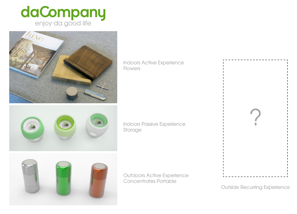
Blenddy was conceived as a marketplace platform crafted to support daCompany, a hardware business, by enhancing their conversation with cannabis consumers. Our aim was to extend the brand's commitment to elevating the patient/product experience by addressing and solving usability challenges through software.
The Aha Moment!
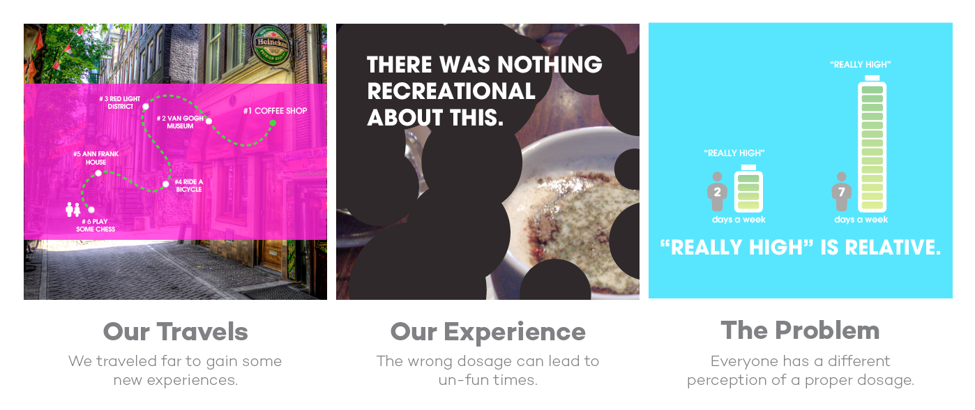
Our 'Aha' moment came from memories of a Amsterdam trip and interactions with an uninspired budtender. We instantly recognized the parallels in the US medicinal marketplace when dealing with untrained staff. So we embarked on a mission to empower patients on their product selection, giving them valuable tools to comprehend proper dosaging.
Observations
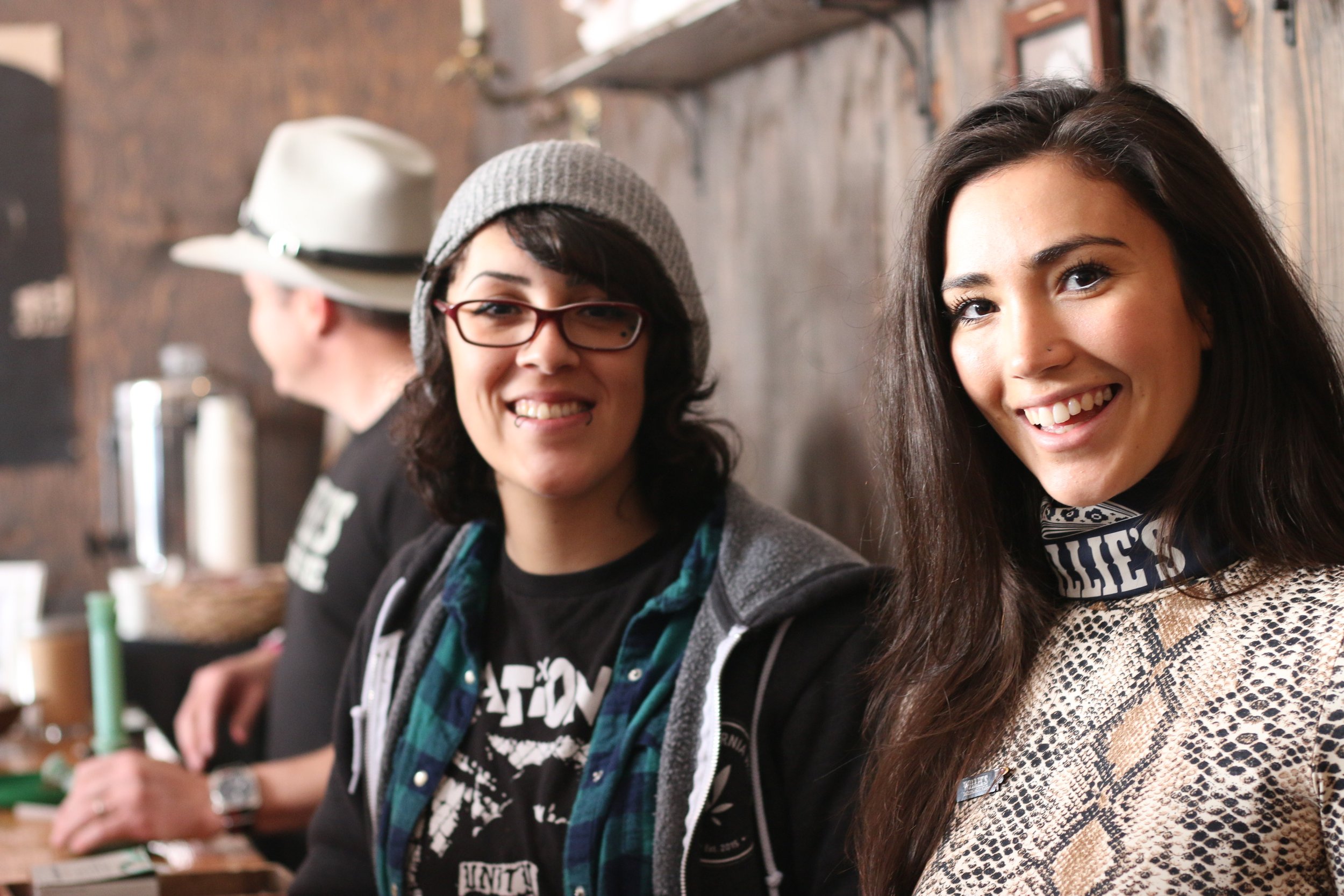
We spoke with intriguing consumers, observed their processes and challenges to discover their roadblocks. On the flip side, we interviewed businesses to gain valuable insights from their expertise. Immersing ourselves in the our target users’ environments allowed us to come away with a wealth of understanding for the product vision.
Qualitative Research
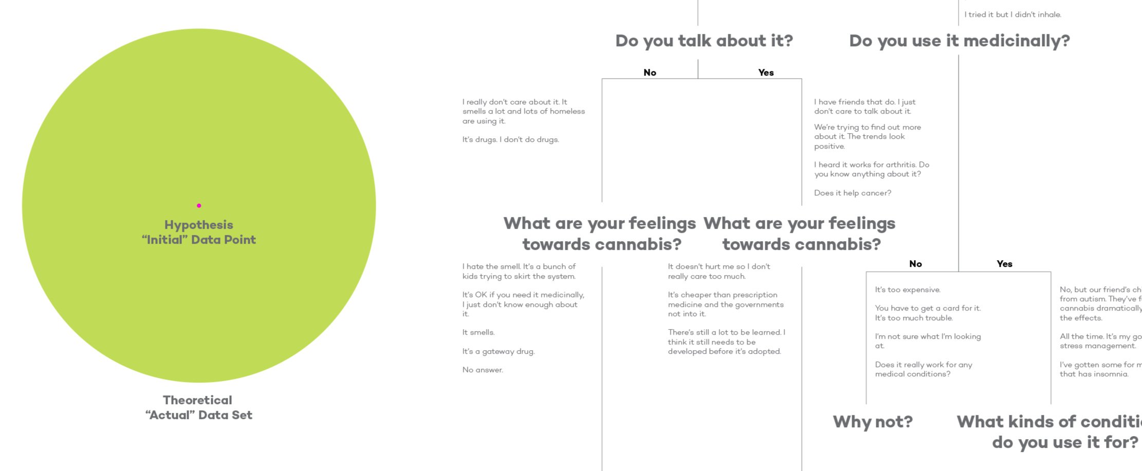
A series of moderated interviews at dispensaries and cannabis clubs revealed that patients used cannabis for a variety of crucial health needs. Beyond just navigating the plant's complexities and potency variability, there remained an underlying stigma clouding the market. It was evident the psychological barriers of social taboo posed equal hardship for struggling patients.
Our discussions uncovered not only product insights but also deeply personal patient journeys, underscoring unmet needs largely overlooked in the recreational space.
Quantitative Research
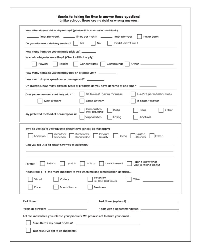
Before we raced to design our product, we stood outside dispensaries to conduct surveys on aligning our findings with mass patients' preferences. Our survey gathered usage data and fostered dialogue on personal motivations. We quantified metrics around product perceptions while also capturing qualitative insights as patients shared experiences in their own words. Blending analytical with empathetic research, allowed us to humanize motivations behind each choice.

Research Trip
I embarked on a research trip to Colorado - the epicenter of the legalization movement. There, I engaged with seasoned dispensary owners to understand their hard-won insights on medicinal trends and emerging health applications. I dove into the local culture to capture authentic patient voices firsthand. I stayed at cannabis-friendly AirBnBs, discovering the growing ecosystem of tourism services. I interviewed a vibrant mix of young activists, aging medical refugees, and free-spirited artists who flocked here to join this cultural moment. On the steps of the Capitol, I stood alongside news crews covering the historic legalized sales paradigm shift. This inside access shaped an invaluable view into the early stages of mass normalization.

Findings
We encountered enthusiasm across ages for this burgeoning market's recreational potential. Lifting restrictions fostered open, uncensored exchanges as people freely shared cultivation tips, oil techniques, and product experiences.
Still, struggles to articulate complex thoughts on cannabis persisted, proving lingering stigma even among advocates.
One tech-related surprise finding - Android devices predominated here versus coastal early adopter markets.
We observed alluring brand names and clever copy outweighing scientific nuance when driving product appeal and sales. Users displayed highly individualized paths of product discovery given the overwhelming variety of available options.

II. Design Process - From 0 to 1
Personas
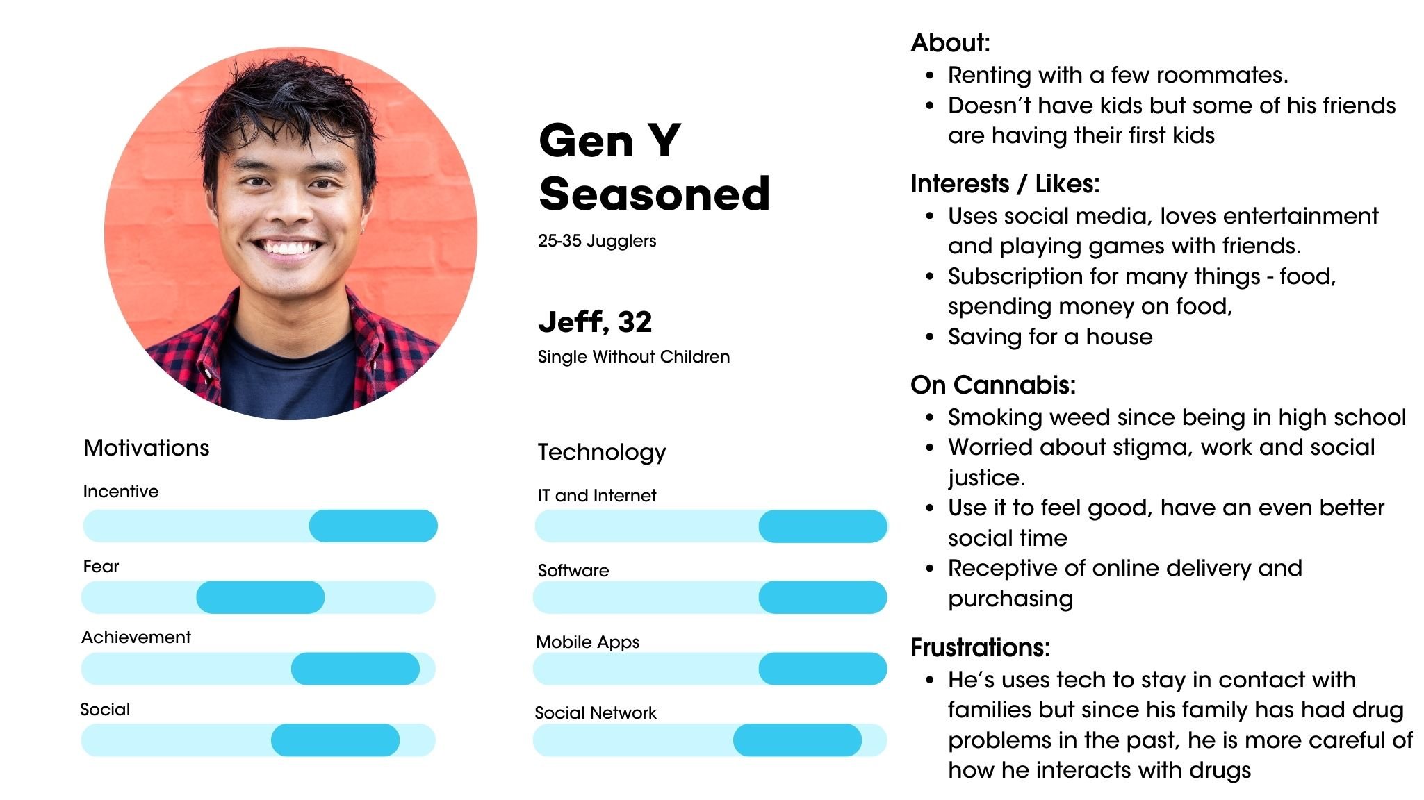
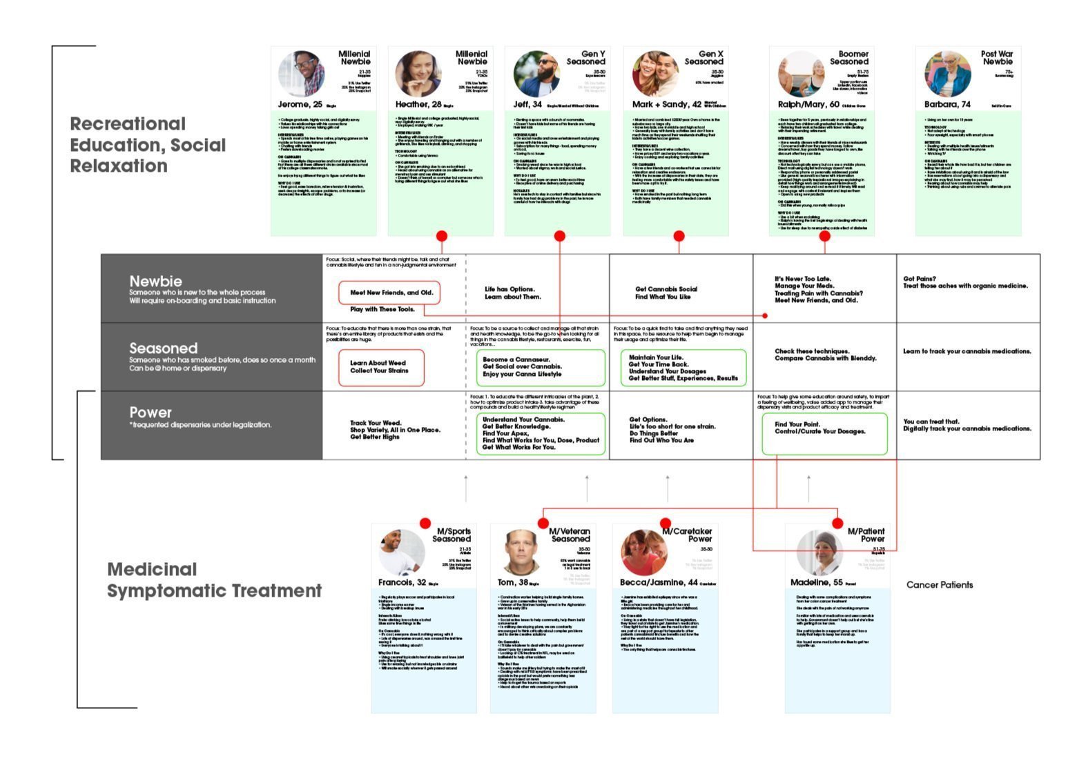
Given the myriad of user product paths before us, we created personas as a foundational guide for directing our features. These personas steered our design choices and also served as the targets for our blog content. We targeted each in our messaging, assuring them we had tailored solutions and tutorials to meet their needs.
Wireframes
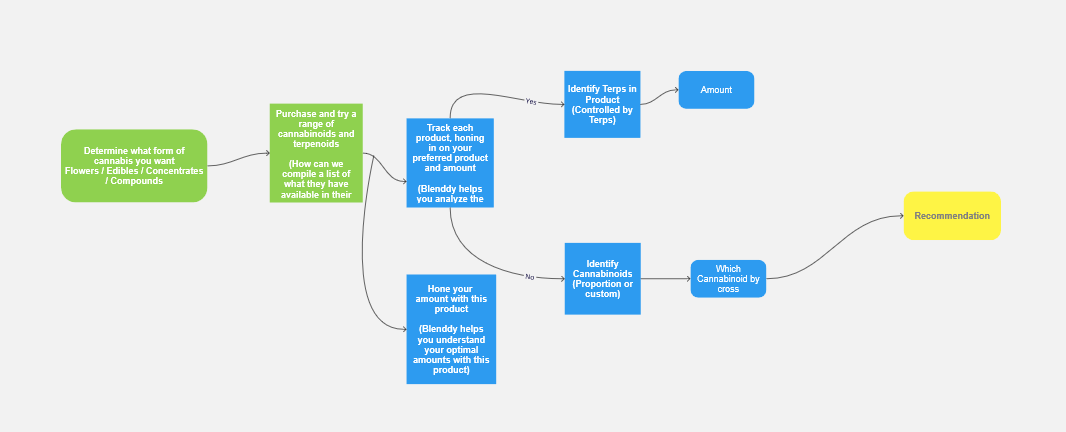
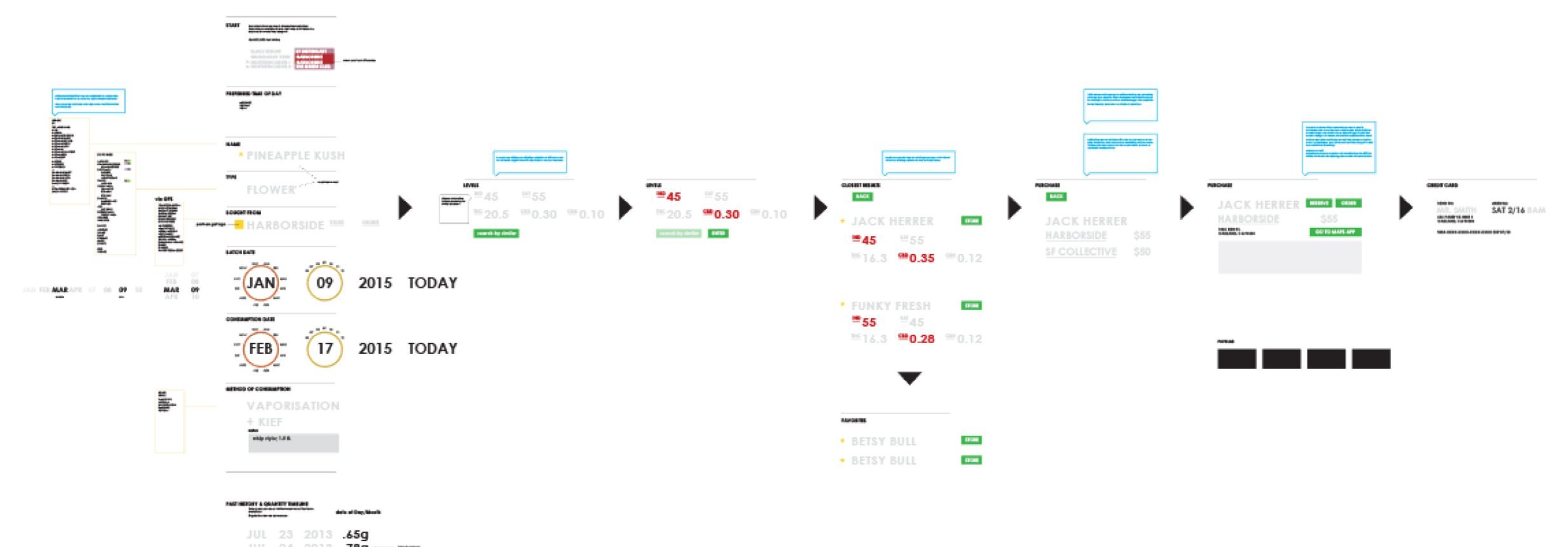
Our sketches and research converged to provide insights into various user experiences, ranging from consumption habits to purchase decision-making. This was the stage where we began to identify how our app could fill gaps and provide essential services.
Feature Prioritization
The task ahead was formidable, especially considering the evolving nature of cannabis science. We had to prioritize functionality with a clear purpose, align it with our business model, and maintain flexibility to adapt to scientific advancements, like the transition from chemotype to terpenoid tracking. Our challenge extended to product tracking and refinement across a multitude of devices, each with unique capabilities such as temperature and percentage dials for heat intensity.
Sketches
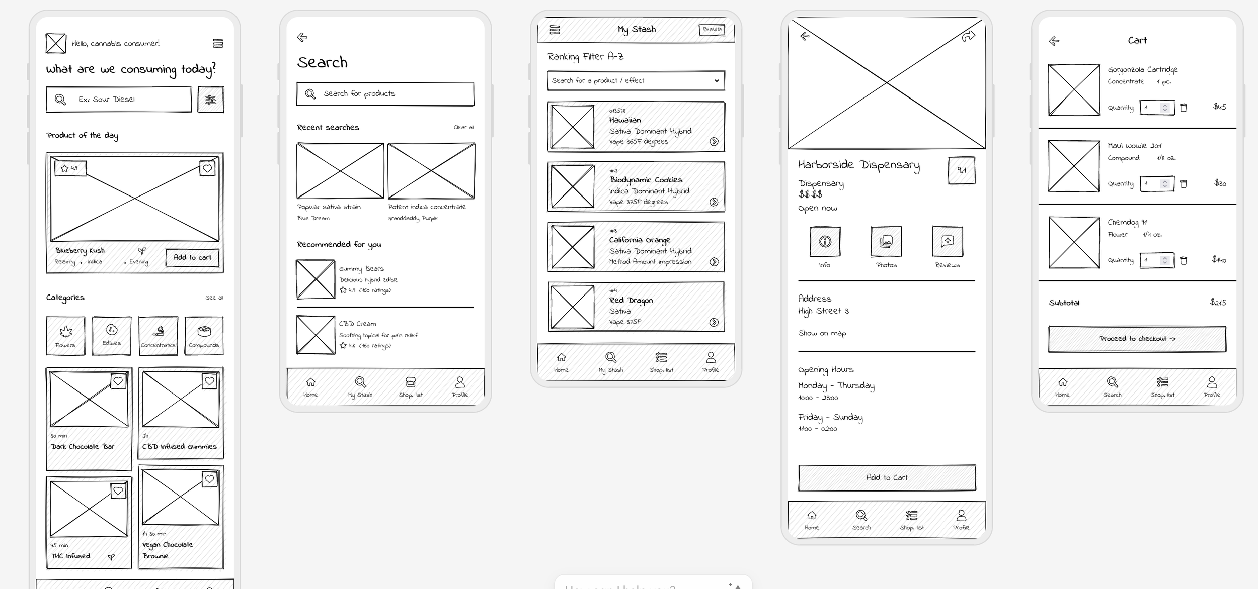
We created a series of rough sketches to translate our ideas onto paper. Each user flow was holistically scrutinized to ensure alignment with every personas’ perspective and consistency within our product. Monetization, a core objective, began its focal point during this phase.
First Visualization
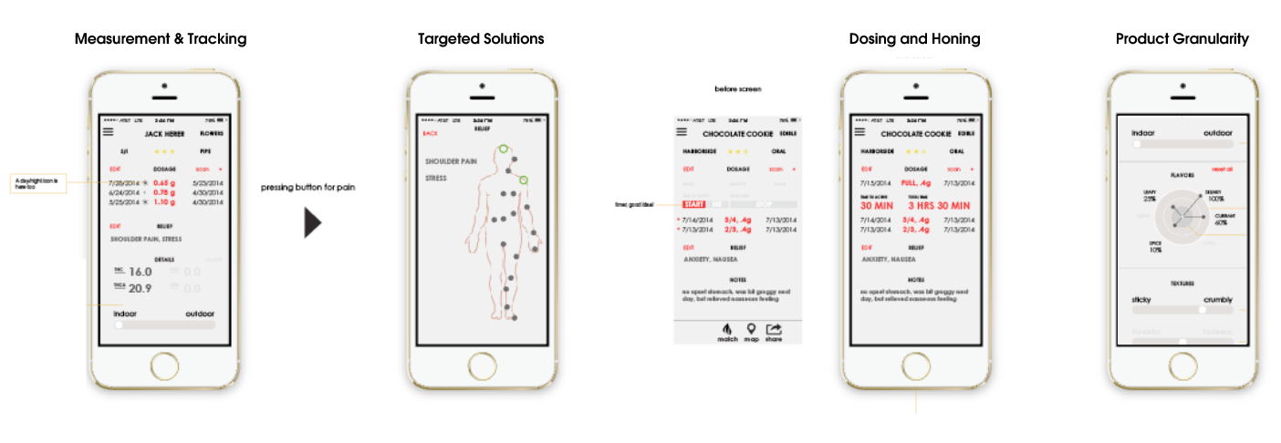
When defining the product premise, we began by formulating assumptions on how to present the researched information from our users through an ambitious graphical interface. This interface, while aiming high, was designed with the conscientious intent to seamlessly align with our business objectives. Our primary goal was to create an engaging platform that encouraged users to return regularly, allowing them to monitor dosing intricacies and become adept connoisseurs of their own product.
Minimum Viable Product
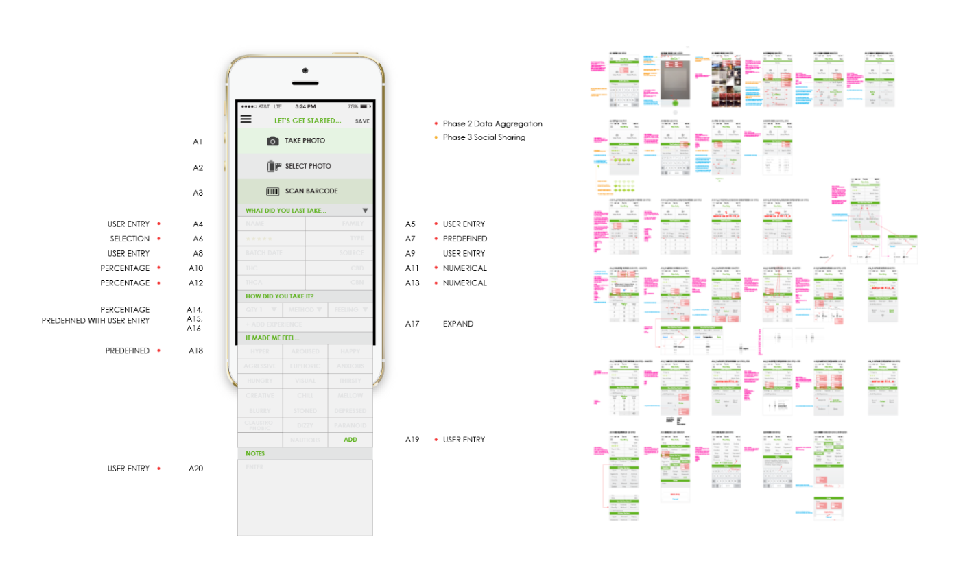
Our MVP covered the gamut of product categories, with the aim to garner feedback allowing us to enhance and streamline the experience with consistency across categories. Throughout this phase, we dedicated our efforts to refining the flow and entry of information, along with consolidating data presentation.
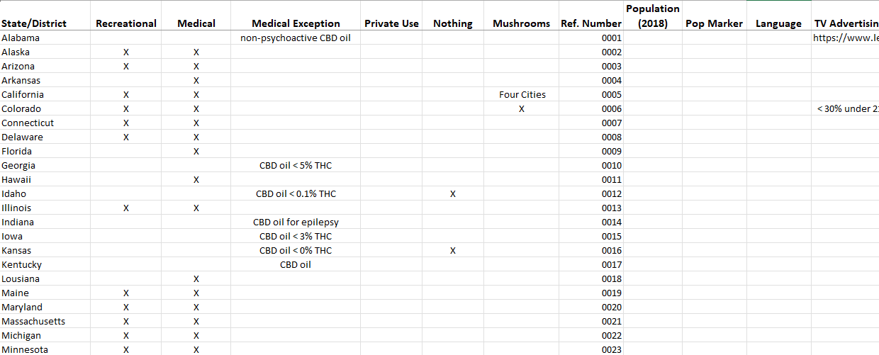
While the main surface represented a "data compilation," and apperared simple, the underlying support and product offering knowledge were immense. Tracking this myriad of categories, required substantial backend infrastructure and domain expertise to capture this level of complexity.
Ethical Design and Data Security
Securing approval for the app posed challenges, especially in the early stages of this evolving landscape. We had to navigate stringent requirements, particularly for Apple's platform, to mitigate potential legal risks. Implementing state-to-state restrictions and adding a voluntary PIN protection layer were essential steps in enhancing data security. As the regulatory landscape evolved, so did our data storage strategies, underscoring our commitment to maintaining ethical and secure practices.
Information Architecture
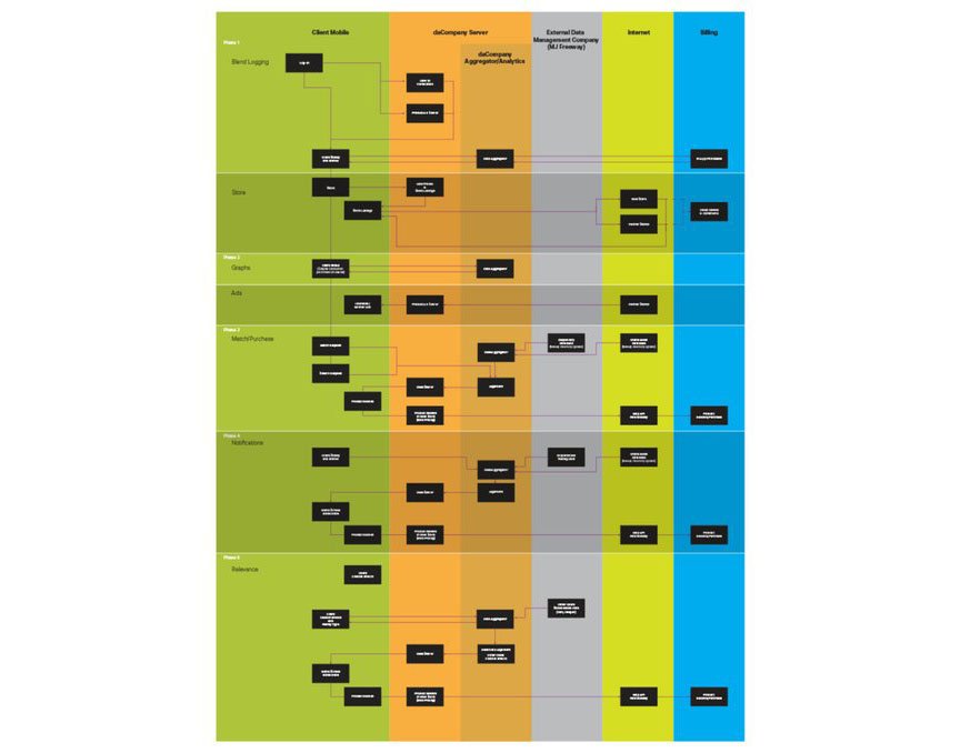
As we expanded the functionality, we aimed to provide a cohesive buying experience between advertisement intervals. To do so, we outlined every key component’s relationship flow to CTA screens and backend data. Detailing the data architecture ensured a seamless flow and unrestricted user navigation to prioritize flexibility over linear processes.
MVP Logomark
iOT Exploration
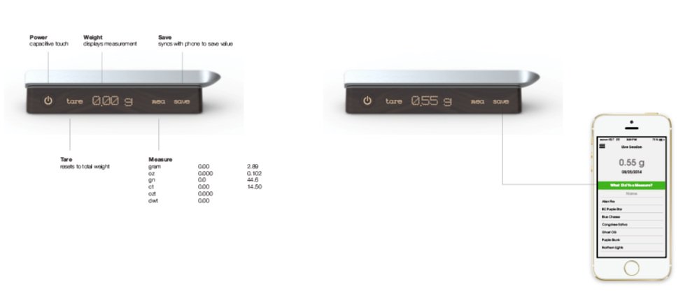
We delved into incorporating Blenddy with sidecar iOT hardware experiences. This wireless scale offered users an efficient solution for dosing and to see if we could reduce the number of software input steps through hardware.
Usability Testing
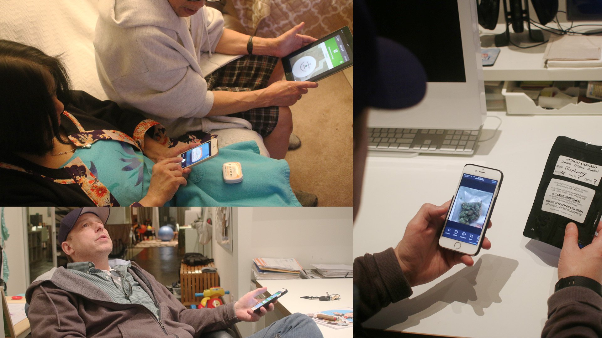
We conducted usability testing with a diverse range of medicinal and recreational participants. While our initial assumptions about user needs were often accurate, responses were that the product tracking input was still overly complex. Striking the right balance between simplifying the user interface and streamlining information input required meticulous iterations.

III. The Pursuit of Perfect Usability - From 1 to n
Iterative Design and Testing for V2
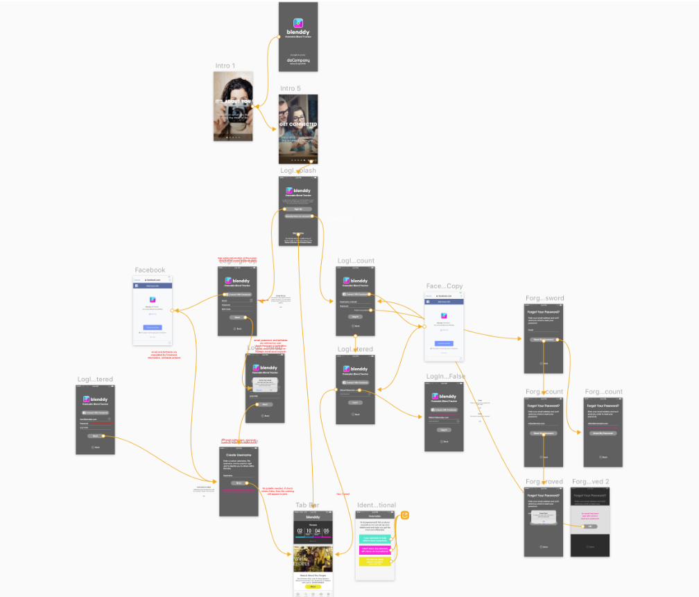
Utilizing InVision and Sketch, we meticulously constructed each feature, facilitating thorough testing and discussions with the team. This allowed us to identify any issues and determine the most effective technical approach based on our tech stack and requirements. This comprehensive process was applied to every feature to ensure frictionless functionality in the real world.
Watch Functionality
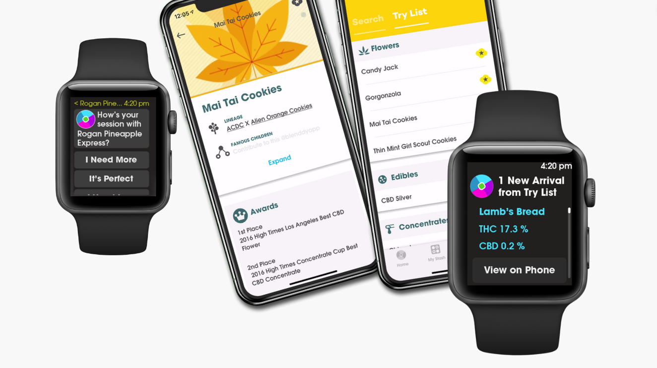
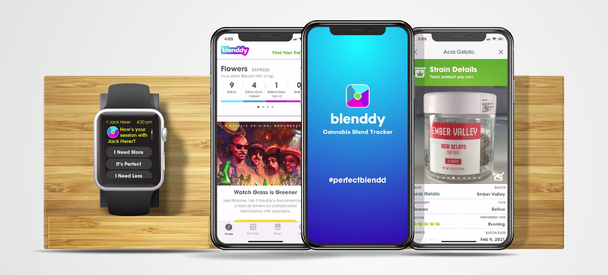
Integrating watch functionality marked a pivotal milestone. Through careful analysis of user research, we pinpointed key components poised to benefit from real-time notifications. Our objective was to deliver timely information, including alerts for newly arrived products, algorithm-driven match notifications, and reminders for ongoing sessions.
Version 3: Achieving Excellence with a Multi-Platform Design
Once we dialed in the features, we pursued a strategic shift to include Android mobile devices. We embraced the Dart programming language for seamless cross-platform compatibility while streamlining QA processes. This initiative optimized releases, promoted scalability, achieving cost-effectiveness and positioned us for future technological advancements such as voice integration and artificial intelligence.
We examined all app interactions with regard to Flutter models, which led to a major menu interface revamp. We capitalized on this refactoring opportunity by including new categories, expanding to mushrooms and caffeinated products.
Main Menu Overview
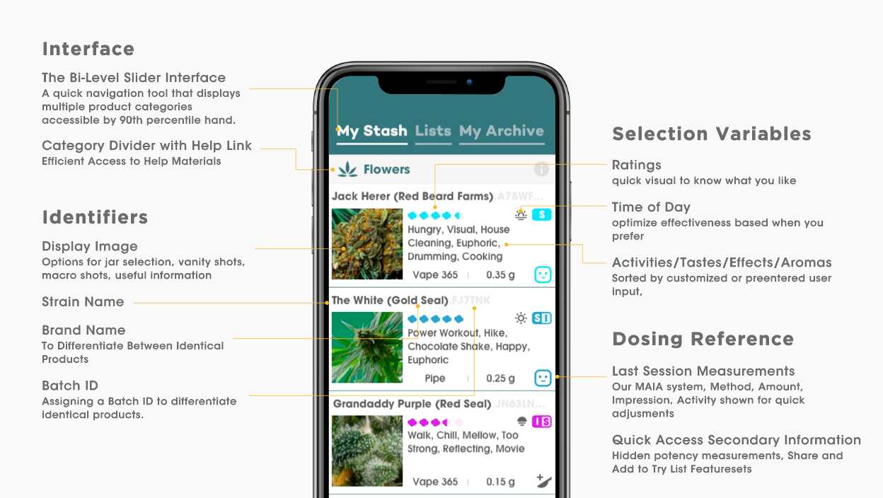
The introduction of a cross-menu bar proved to be a significant enhancement, aligning various interfaces and emphasizing our commitment to consistency in user interaction throughout the app.
Track -> Log and Use
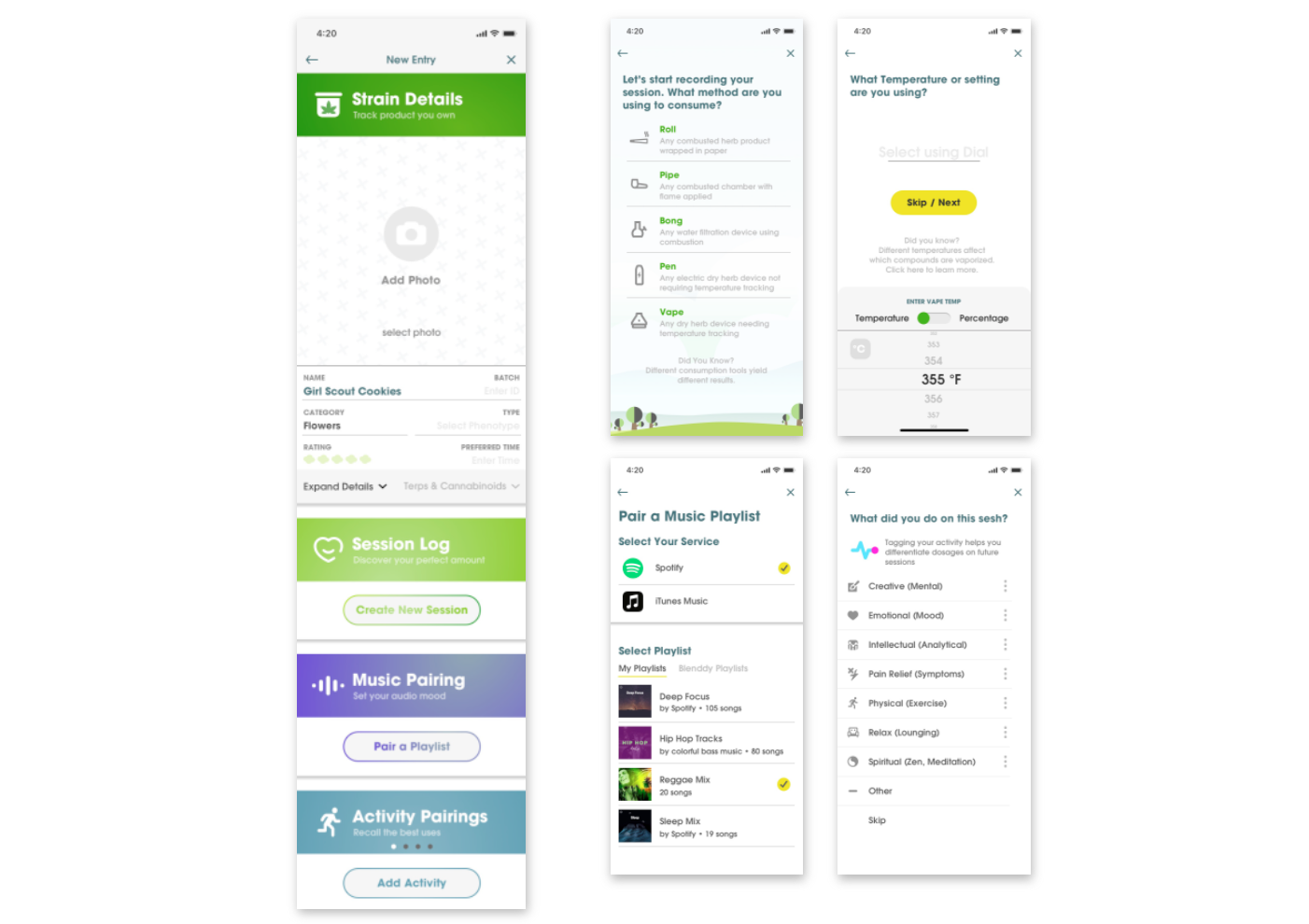
"Track" stands as the cornerstone of Blenddy's functionality. Our intention was to streamline a user’s decision-making experience while increasing approval of their final outcome. Drawing insights from user interviews, we deconstructed the experience wheel into five key sections.
Our team converged on a long form entry page with expandable sections as the optimal solution, giving the end user any needed information to select from their strains. This approach ensures users can consistently contemplate the product through the lens of their past experiences, facilitating informed choices.
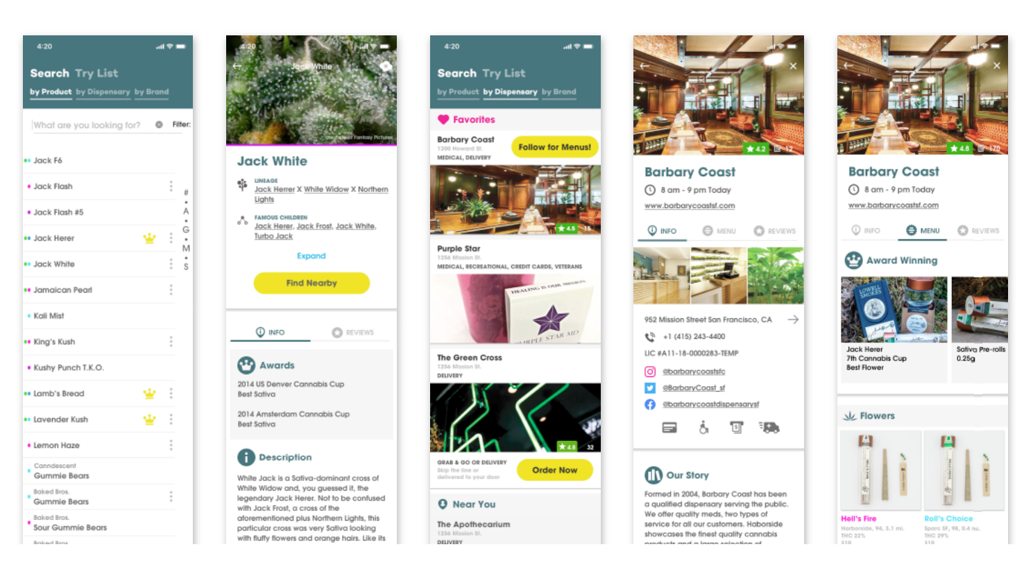
Discover -> Tag and Find
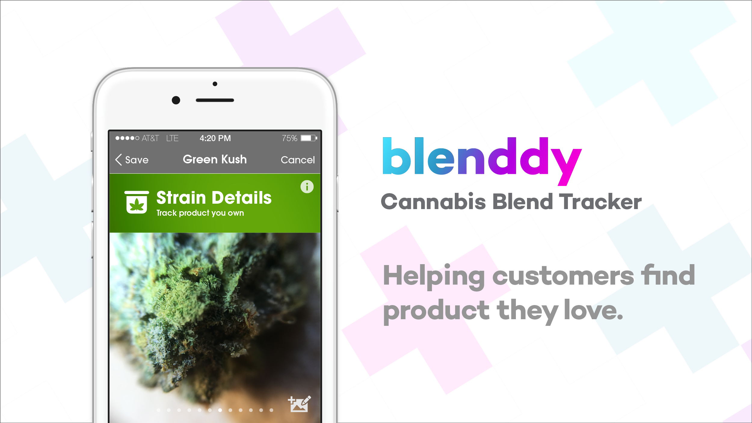
"Discover" stands as the second pivotal component in the Blenddy customer experience. After consumption, we aimed to streamline the product search process for consumers through hyper-fast name lists. Addressing the challenge of navigating over 10,000 strains, each with its unique compound makeup, we introduced a solution. Users can effortlessly find and tag products, adding them to a shop list seamlessly matched with available inventory.
These features are strategically placed to guide customers to their shopping destination, enhancing user convenience. Furthermore, the impact of this positioning extends to our partners' business pages, aiding them in robust advertising endeavors.
In our pursuit of innovation, we introduced a revolutionary feature. For a hands-off approach, customers receive personalized recommendations based on their product preferences, intelligently matched to terpenoid proportions. This cohesive blend of functionalities ensures a dynamic and user-centric experience, transforming how users navigate and discover cannabis products.
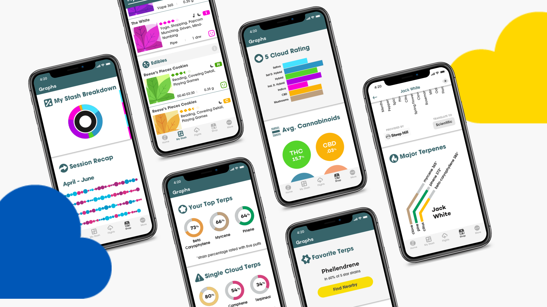
Learn -> Advanced Data Visualization
Our aim with advanced data visualization went beyond just putting together medical data; it was about making our users' interaction with our product enjoyable. Our data visualization model turned consumption data into visually engaging info, giving users a quick and handy overview to spot their preferences. We wanted to make the whole purchasing experience smoother for them, all while providing valuable insights for our B2B partners.
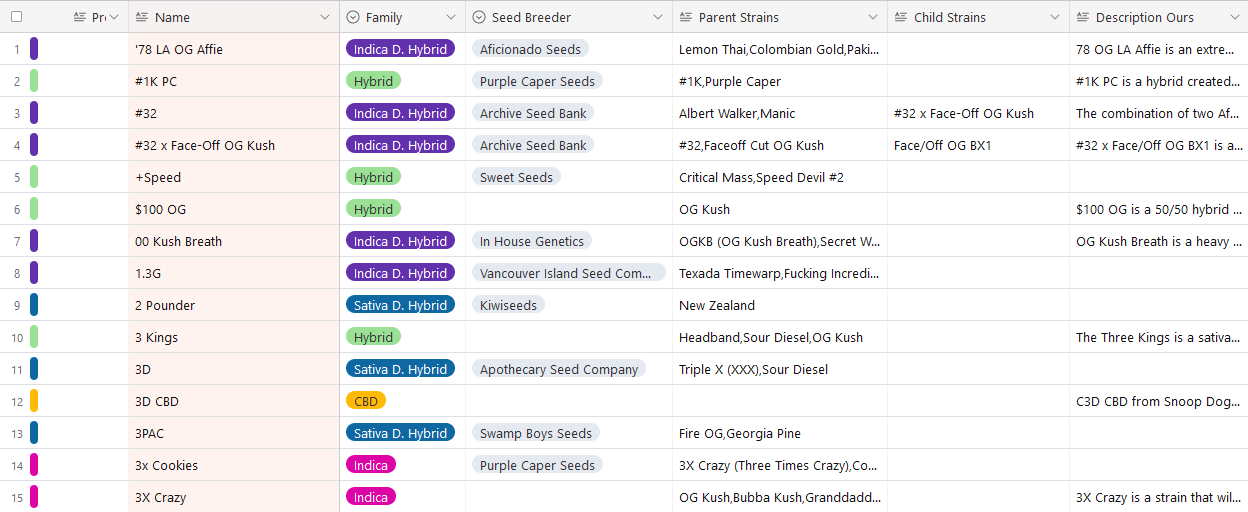
Libraries & Data
I compiled and maintained copious product libraries in addition to captured data sets. We figured out and linked live inventory data to provide up-to-date inventory for users.
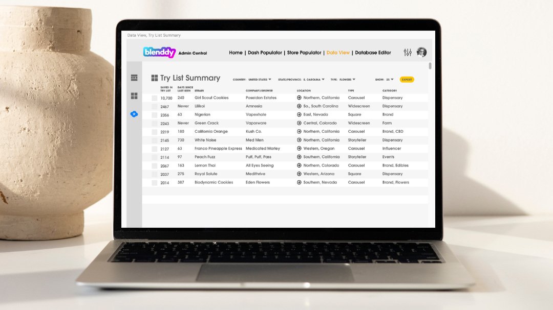
B2B Editor
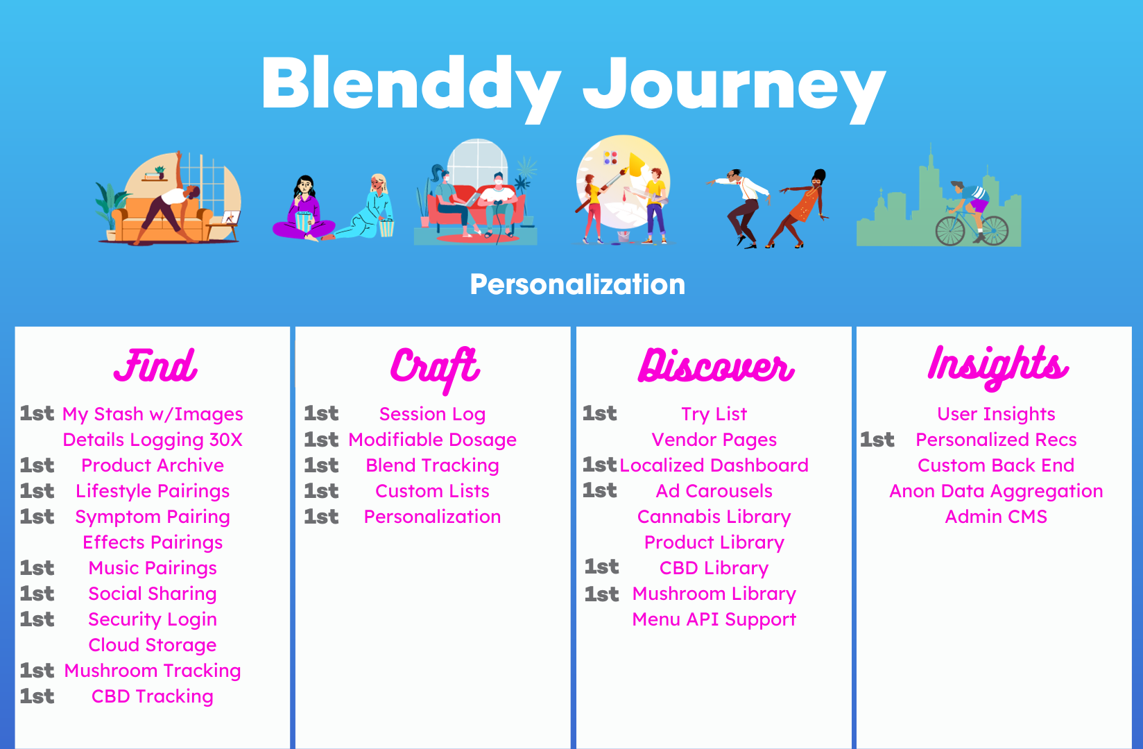
Some of our 0 to 1 accomplishments

IV. Business and Strategy
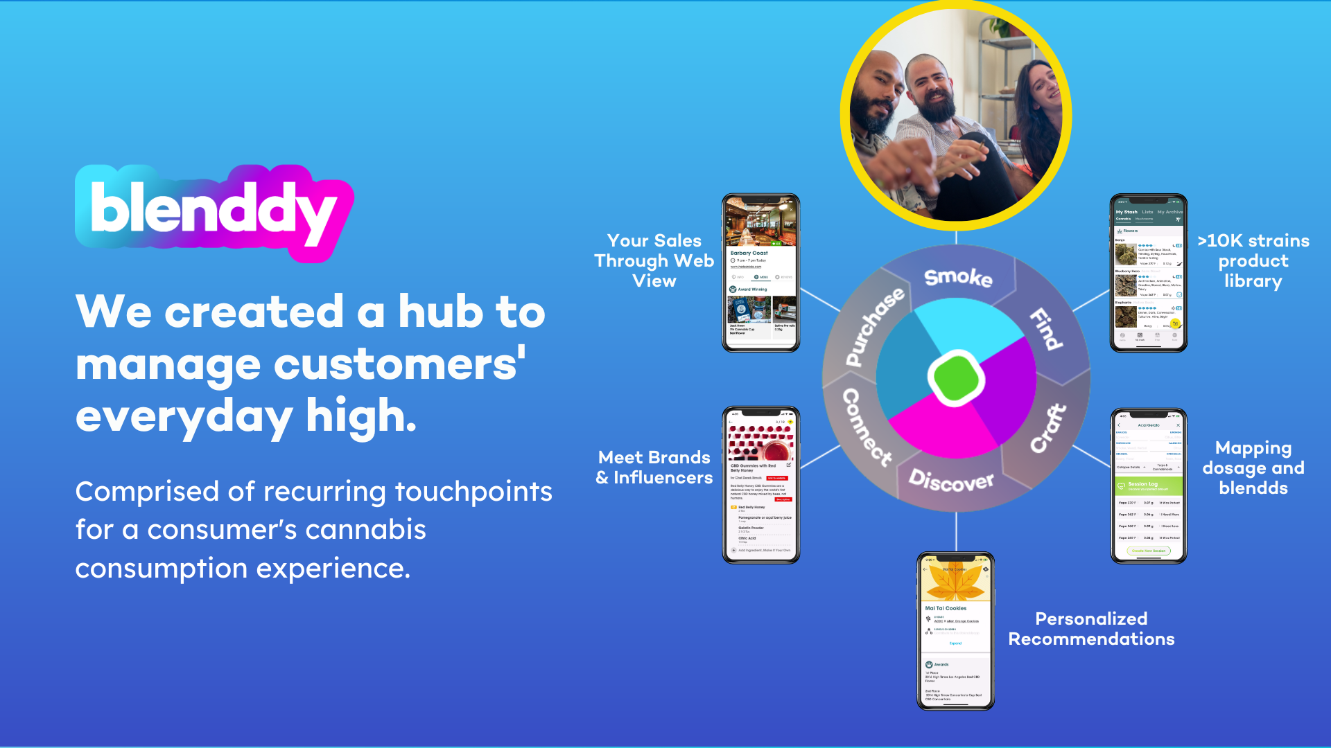
Business Strategy
Entering a highly dynamic landscape, we maintained a steadfast vision for Blenddy's future. Our singular focus was to emerge as the premier platform for people to explore cannabis products and lifestyle choices. Recognizing the significance of bridging the gap between medicinal and recreational use, we understood that cannabis encompasses a myriad of lifestyle choices beyond mere consumption.
Our mission was to establish ourselves as their go-to knowledge base for cannabis products, empowering users to optimize their product usage and alleviating the substantial friction and ambiguity associated with product discovery.
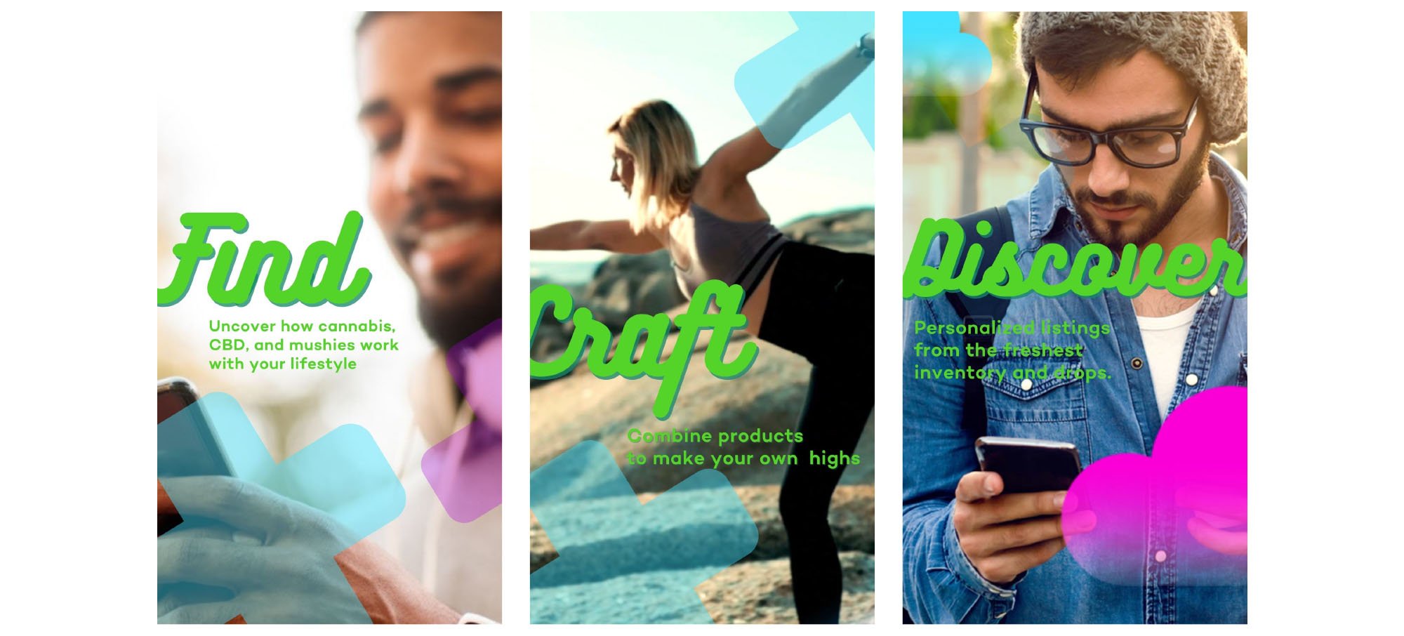
Market Strategy
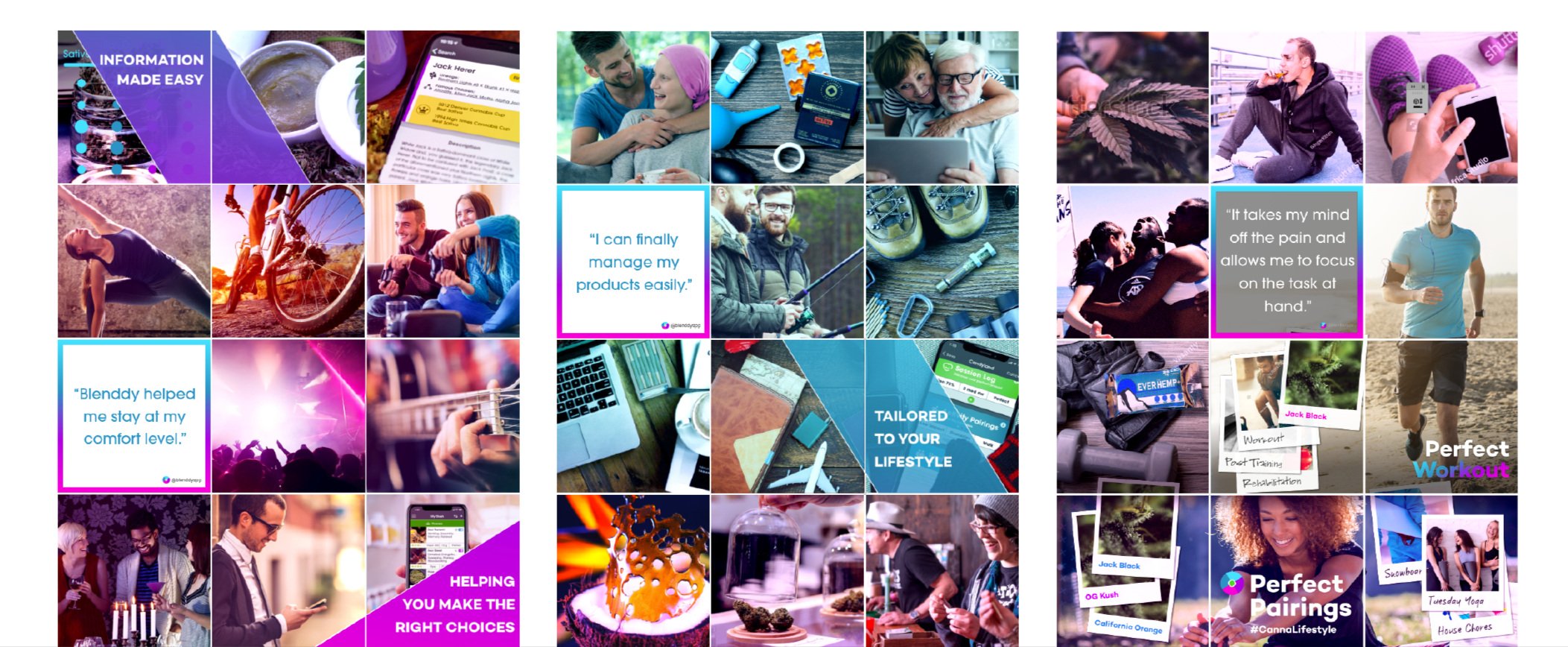
Navigating the intricate web of regulations, we strategically channeled our energies into social media. We formed partnerships with cooks, musicians, athletes, and other influencers who grasped the power of curation and informed consumption, especially the nuances of cannabis dosing. We tailored our branding to appeal to millennials by aligning with the latest lifestyle trends, not only in language and colors but also by standing out as an innovative player in the field.
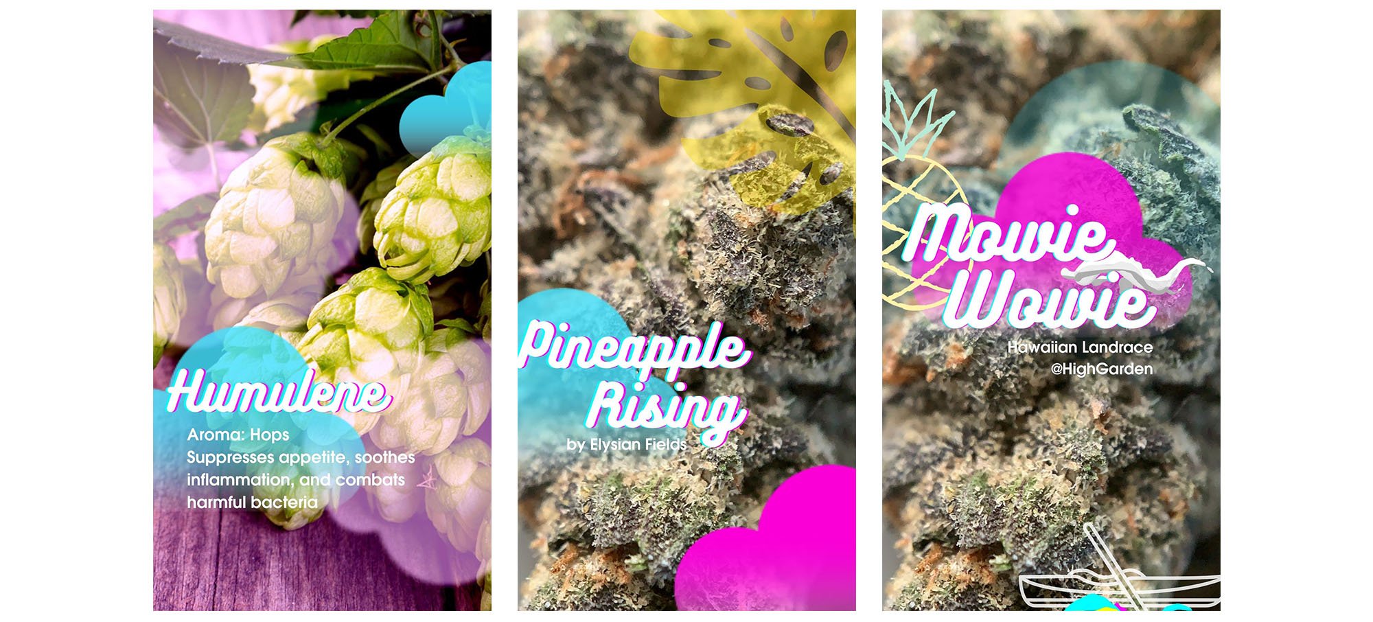
Advertising
In a regulatory environment with constraints on interstate advertising and customer tracking, we saw a unique opportunity. How our product functioned hinged on how we approached potential business partners. We aimed to seize the advantage offered by these limitations to craft an innovative advertising approach.
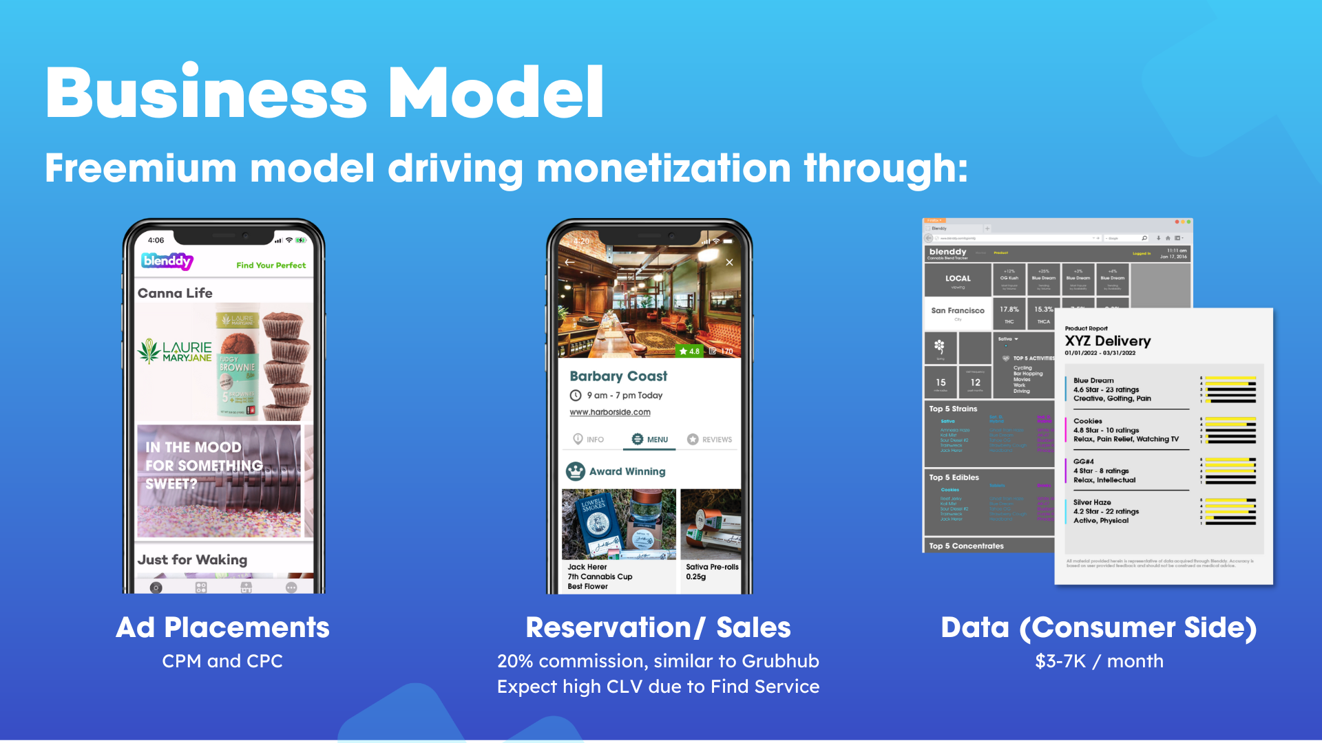
Revenue Model
To sustain our vision and fulfill investor expectations, we crafted a revenue model that consisted of three fundamental components to reach profitability - ad placements, reservations/sales, and B2B data offerings. Each was carefully considered to ensure competitiveness across a changing landscape while remaining scalable.
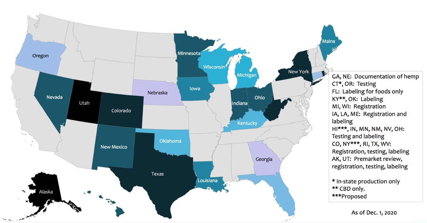
Regulatory Challenges
Our journey was marked by an array of challenges — from the complexities of legalization, decriminalization to compliance with HIPAA laws, platform regulations, and the intricate web of product laws covering cannabis, hemp, CBD, and more. Each challenge required a thoughtful and compliant approach, while we also kept a watchful eye on the timelines of competitors and other industry players.
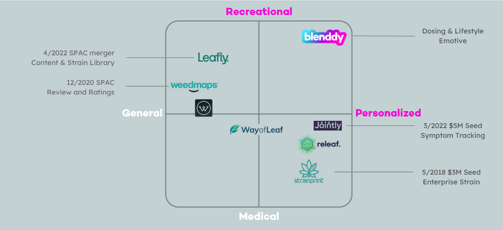
Competition Analysis
We meticulously studied our competitors and delved into practices and strategies from diverse industries. This exercise allowed us to identify best practices, adapt them to our context, and maintain a touch of originality. We carefully tracked our competitors' activities, all the while guarding our own strategies and innovations.
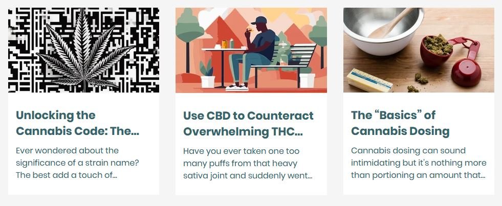
AI Integration
Content served as a crucial avenue for connecting with our audience, prompting exploration for cost-effective delivery methods. By leveraging cutting-edge practices and strategically incorporating AI tools, we streamlined our processes. This approach enabled us to produce blogs, newsletters, social media posts, and adapt our website messaging with agility and efficiency, all within the constraints of a limited budget.
Data-Driven Growth
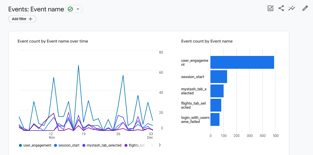
With an eye on analytics, we set up tracking and closely monitored Google Analytics. We attentively observed the performance of our website and blogs, refining our approach as we built our audience and cultivated partnerships with influencers. This data-driven approach guided us in moving our audience down the marketing funnel, allowing us to optimize our strategies while building a vibrant and engaged community.
Hashing and Fingerprinting
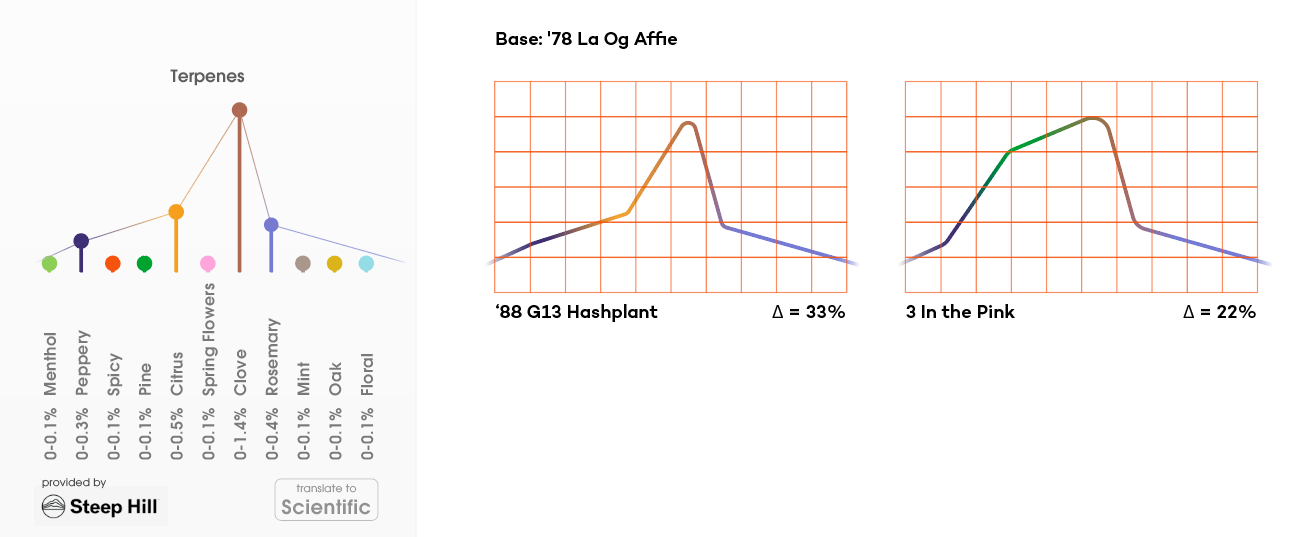
Working with our data, we needed quick ways to cross reference. I implemented the AI system to hash out our data model and create the fingerprinting required to quickly match and recommend products.

V. Design Systems
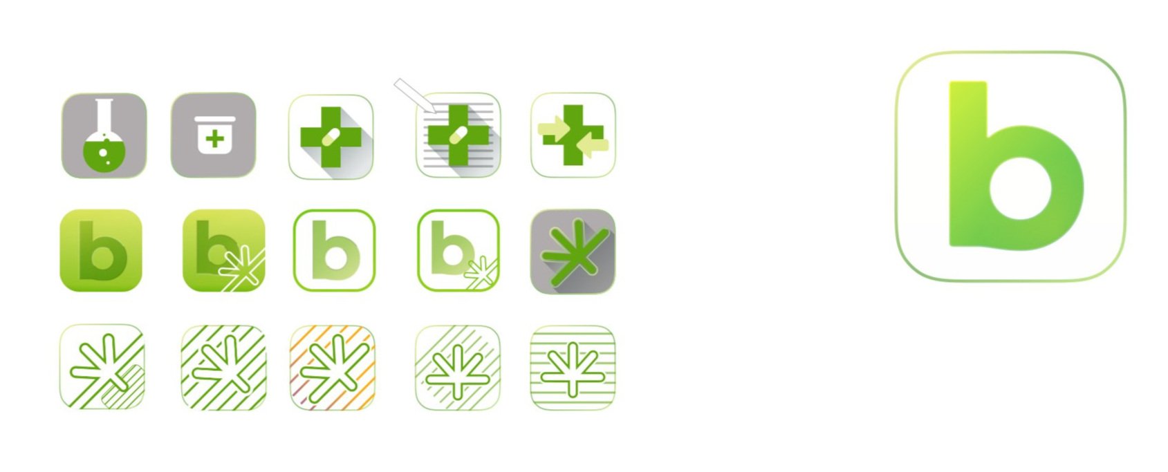
I spearheaded the comprehensive development of the entire architecture for our design system, establishing the necessary organizational contexts to ensure a seamless and cohesive user experience. This encompassed the creation of a comprehensive iconographic system, a visual language that extended beyond mere text. Through thoughtful use of pictures, I identified items to enhance visual recognition. Colors played a pivotal role in conveying essential concepts – from cool to warm hues for different highs, to representing various types of cannabis such as sativas and indicas, and even capturing the organic composition of terpenes.
Final Logomark
Colors
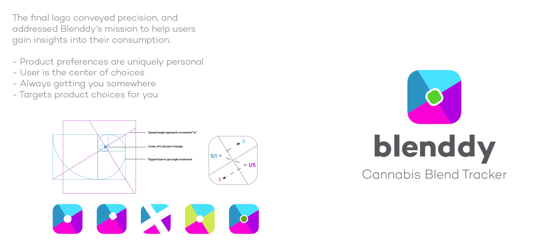
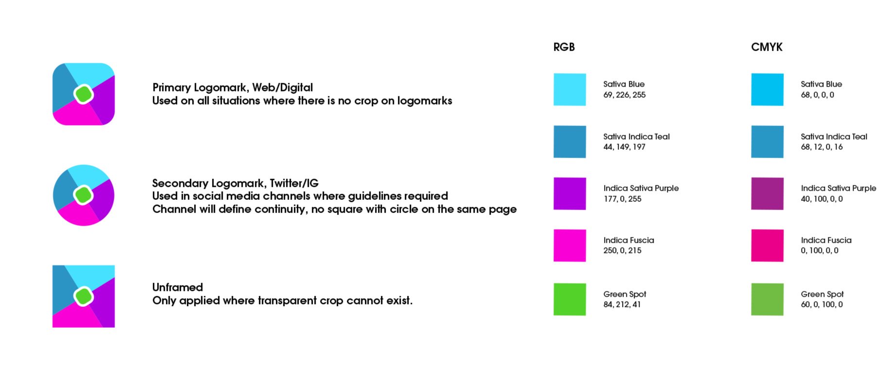
Our logo colors were carefully chosen to symbolize distinct product categories. Sky Blue embodied the energizing Sativas, while Ground Red signified products with relaxing effects. Positioned at the center was a representation of products harmonizing with individual users, creating a holistic experience.
App UX Colors
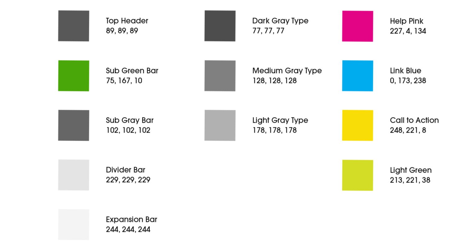
Navigating various colors, from brand logomarks to backgrounds and product meanings, led us to plan proper color schemes in the app. To ensure cohesiveness, we carefully considered how colors interacted without overlapping our established brand palette.

Icon System
Our design system demonstrated remarkable flexibility, facilitating the seamless integration of distinctive elements, such as psychedelic mushrooms, to diversify our product offerings. This adaptability extended beyond visuals, allowing us to effortlessly incorporate any variety of products with specific dosing requirements. In essence, our design system embraced the dynamic nature of our products, ensuring a user-friendly and continually evolving experience.
Typeface
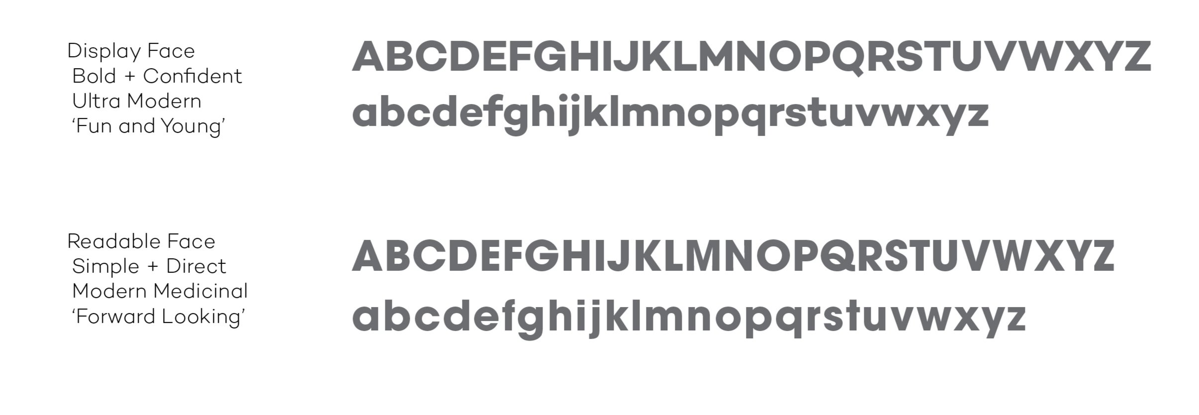
Distinctive, confident, and contemporary, our approach to selecting a typeface in an ever-evolving industry was both unconventional and rooted in scientific principles. This decision-making process unfolded at a time when the industry was still finding its guiding principles and forging ahead.
Misc Packaging / Business Cards / Textures

VI. Marketing
Our marketing required a unique approach that didn’t simply echo what competitors were focusing on. I led brainstorming sessions to help ideate creative positioning and messaging that would energize our campaign. We ultimately centered the outreach around relatable consumer content that conveyed genuine conviction in the value of our product. This helped drive authentic engagement rather than solely promotional content.
I worked to ensure the campaign voice aligned with the user experience we were developing. The end result resonated as approachable yet bold compared to alternative offerings. Our educational content strategy was crucial to highlighting our product’s core benefits in this still emerging space.
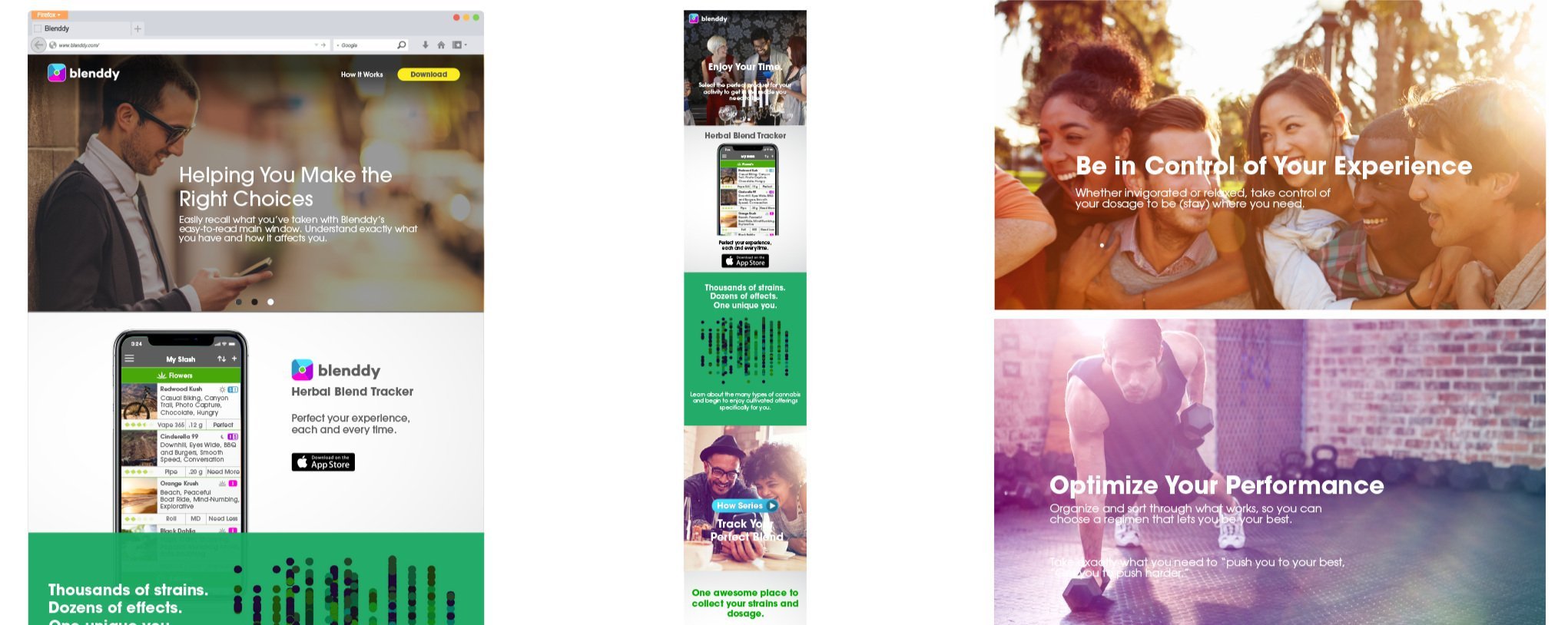
Initial B2C Website and Campaign
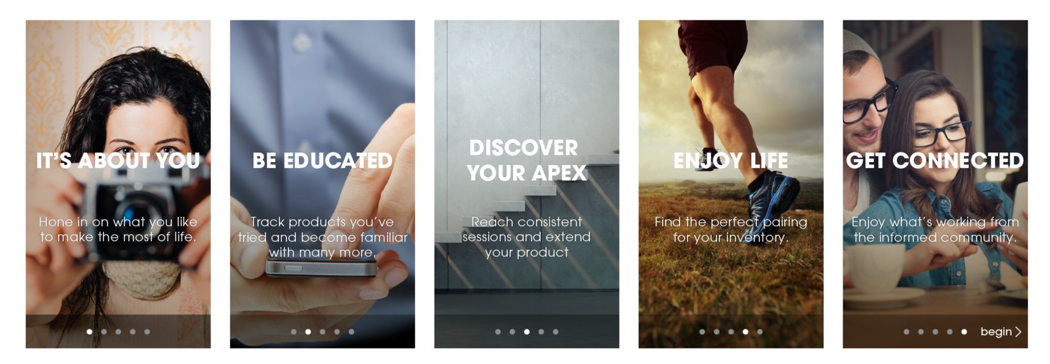
Version two of our website focused on users to highlight the interactions and break the taboo around cannabis.
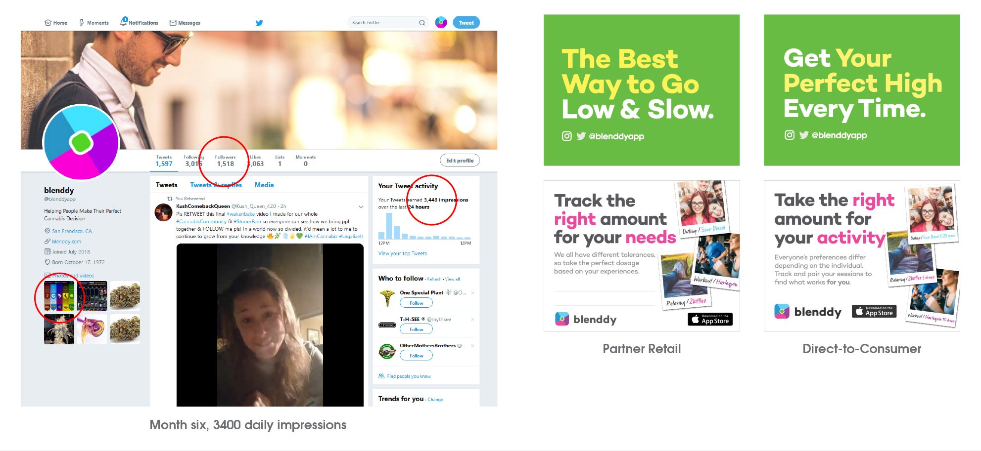
Flyers and Social
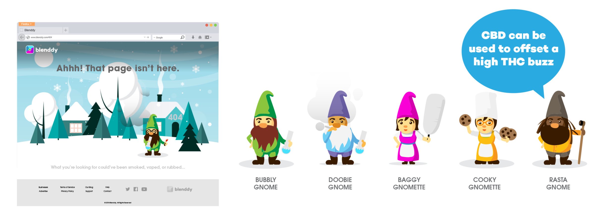
Our Lifestyle Editors
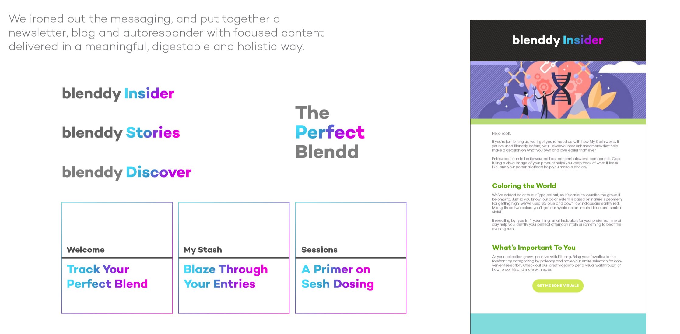
Newsletter Channel
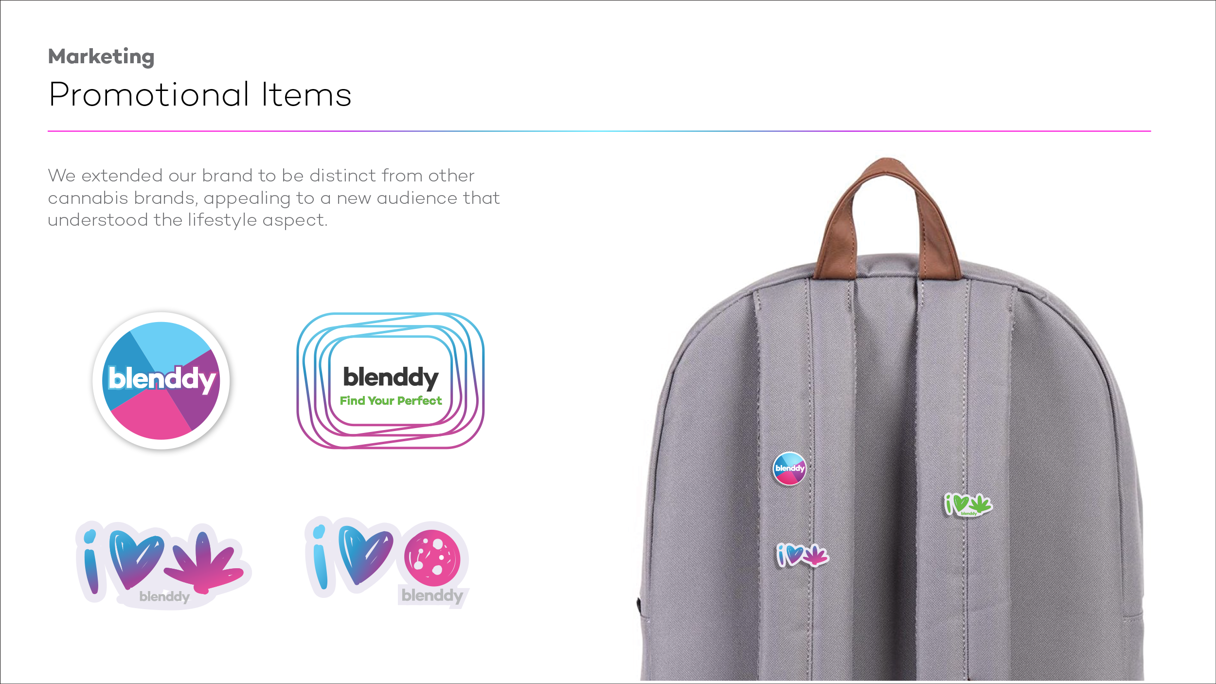
Promotional Items
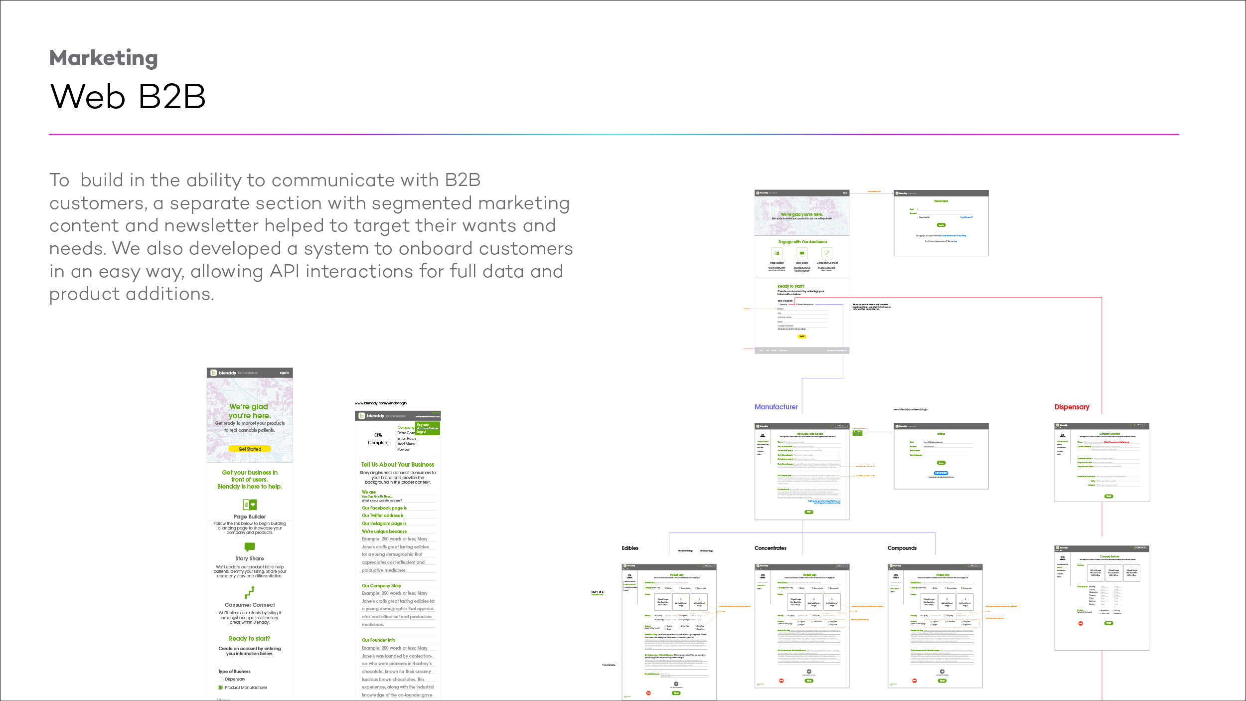
B2B Ingest Tool Website

VII. Cross-Functional Collaboration
Collaborating with diverse and sometimes competitive personalities required adept leadership. I took the lead when necessary, fostering an environment where egos were set aside, and our team's diverse backgrounds were embraced. Even amidst challenging times, such as the COVID-19 pandemic and international conflicts, I successfully brought the team together.
A. Team Leadership
B. Agile and Kanban
C. Collaboration with Marketing, Engineering, and Product Management
Agile and Kanban
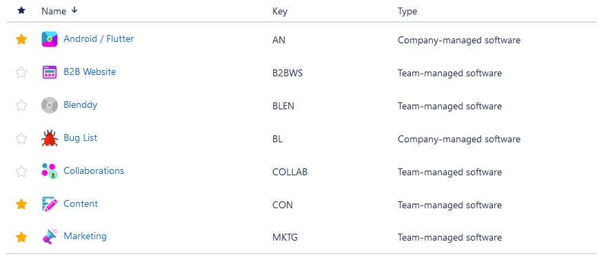
For V3 alone, I oversaw project management using Jira and Confluence to implement Agile and Kanban methodologies. This involved writing project briefs, creating roadmaps, planning monthly milestones, and making necessary adjustments to ensure progress. Over this phase, we cleared over 250 items.
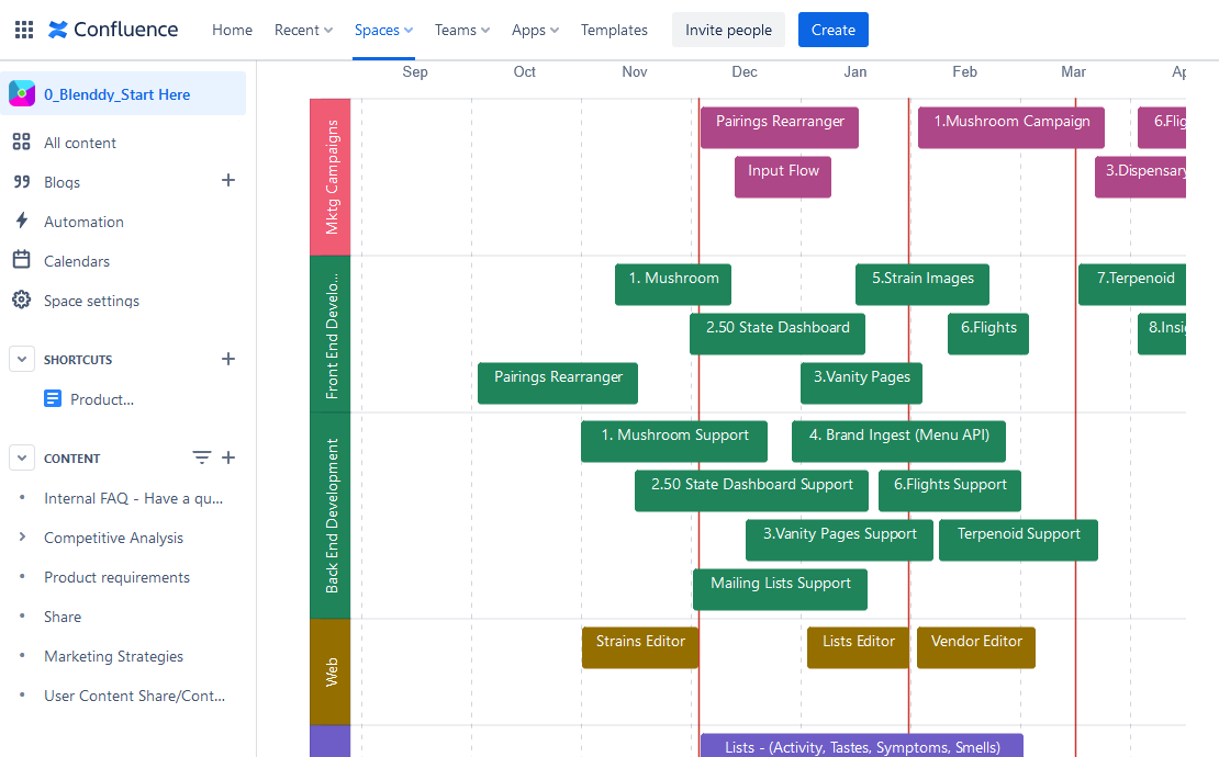
Collaboration with Marketing, Engineering, and Product Management
Making sure development, marketing, and cross-team coordination were strategically aligned was crucial in my role. I prioritized open communication to create a cohesive product. For example, I prompted sharing of vendor feedback with designers and developers. This level of collaboration facilitated integrating our social media launches with the user experience itself. Keeping teams mutually reinforced through consistent messaging was key to executing a polished product that matched our vision.

Team Leadership
My leadership role included rallying the team through difficult circumstances. Our progress was hampered by global instability, but keeping everyone focused on transparent communication and empathy, encouraging open dialogue drove collaboration despite disrupted workflows. I also streamlined our roadmap without compromising vision, helping to regain momentum.
