
Hardware + Design Principles UX Case Study
Cisco Unified Compute Brand Line
Overview
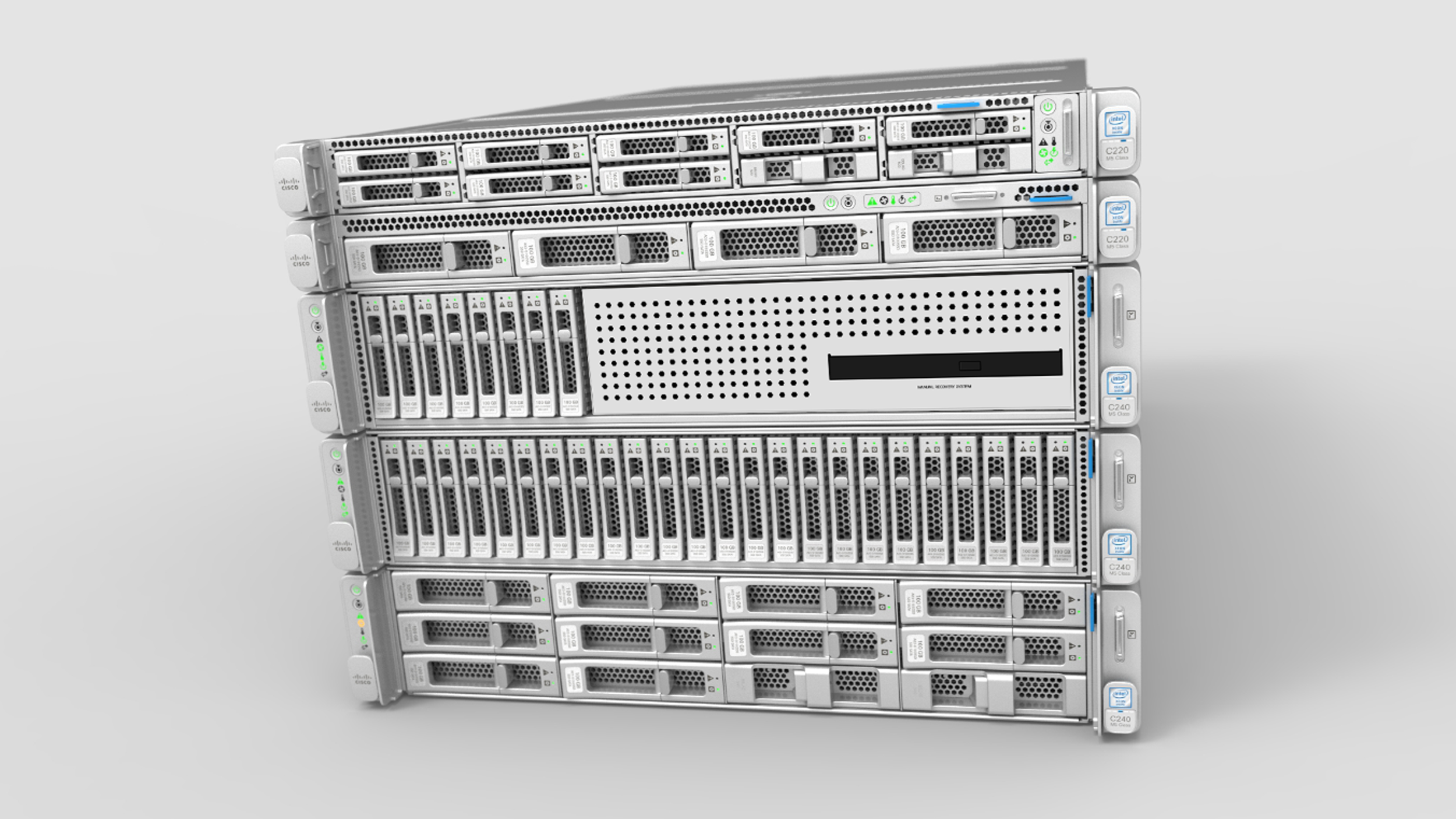
Explore how I played a pivotal role as the Technical ID Lead for Cisco Unified Compute Systems, refreshing the M5 generation of Skylake and Purley powered products. This case study details my involvement in applying the successful brand unity initiative from Cisco's Collaboration products to its Networking products. With a portfolio of 12 SKUs driving over $4B per year in sales, the refreshed design of converged, hyperconverged rack servers and blades led to client retention for at least two generations - a first for the group.
Challenge
An overarching challenge for this program was liasing with multiple business verticals, each with their own unique ideas but with limited design expertise. As the first project out of the gate, we tackled touchpoint ambiguities, solving for potential failures over the product life cycle and creating a flexible framework that could accommodate upgrades and various sales permutations.

UCS creates converged servers combining storage, compute, networking, and virtualization into a single machine powering the mobile internet. However, these "black boxes" are often tucked away in data centers with little regard. Our team worked to change the public perception of Cisco's hardware, as well as how the internal organization viewed them.
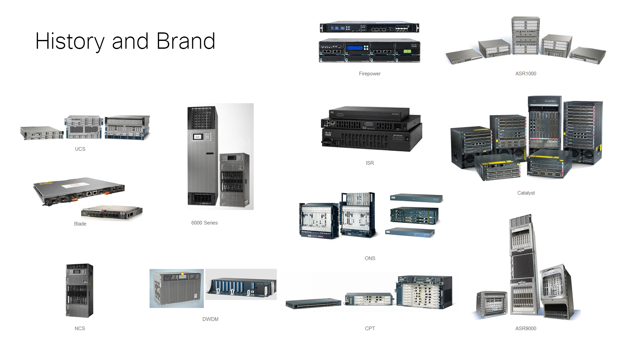
Cisco's "Pro" products, which include switches, servers, and routers, are highly profitable, but also faced significant criticism during the branding process. As the leader of the initial programs, I worked to expand the brand's guidelines and persuade stakeholders to adopt the new branding approach.
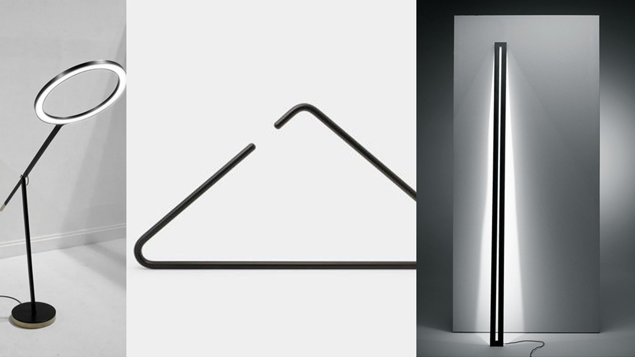
Getting management comfortable with change was a critical goal, with billions of dollars at stake across 12 different verticals. We used an aspiration-based approach, starting with a component for feedback and approval before tackling the entire program.
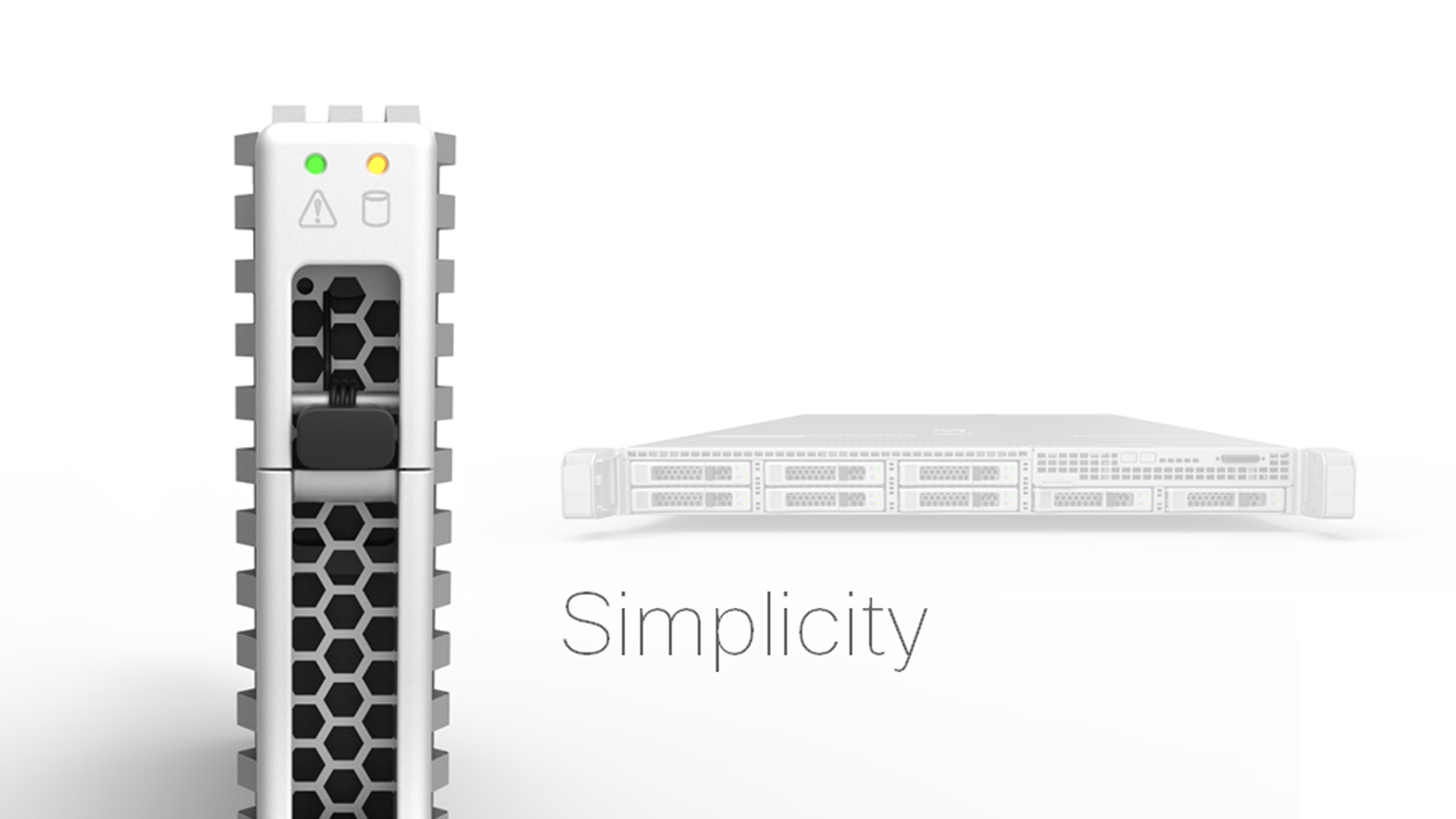
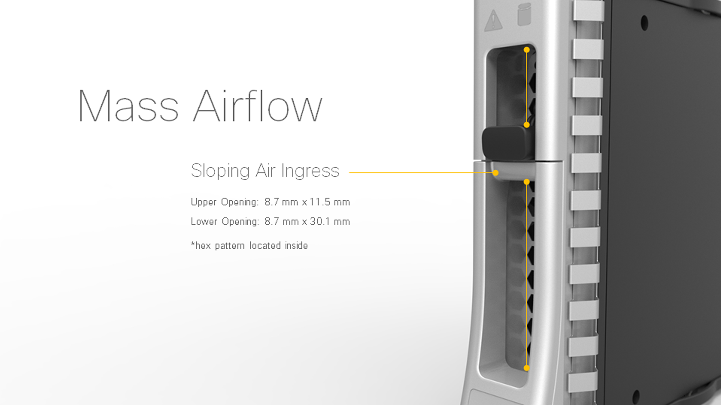
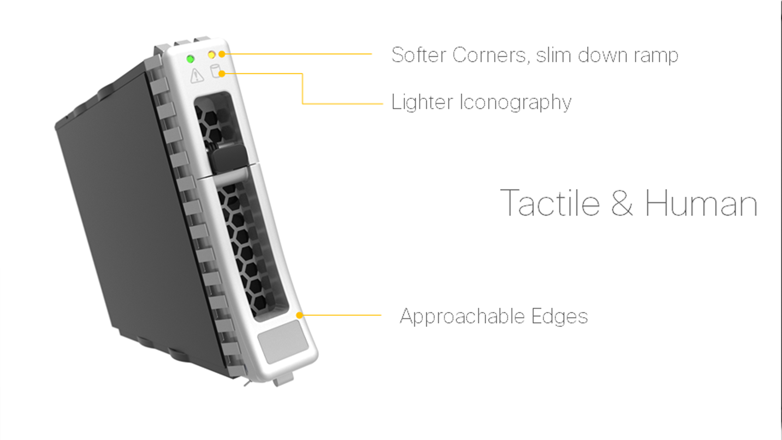
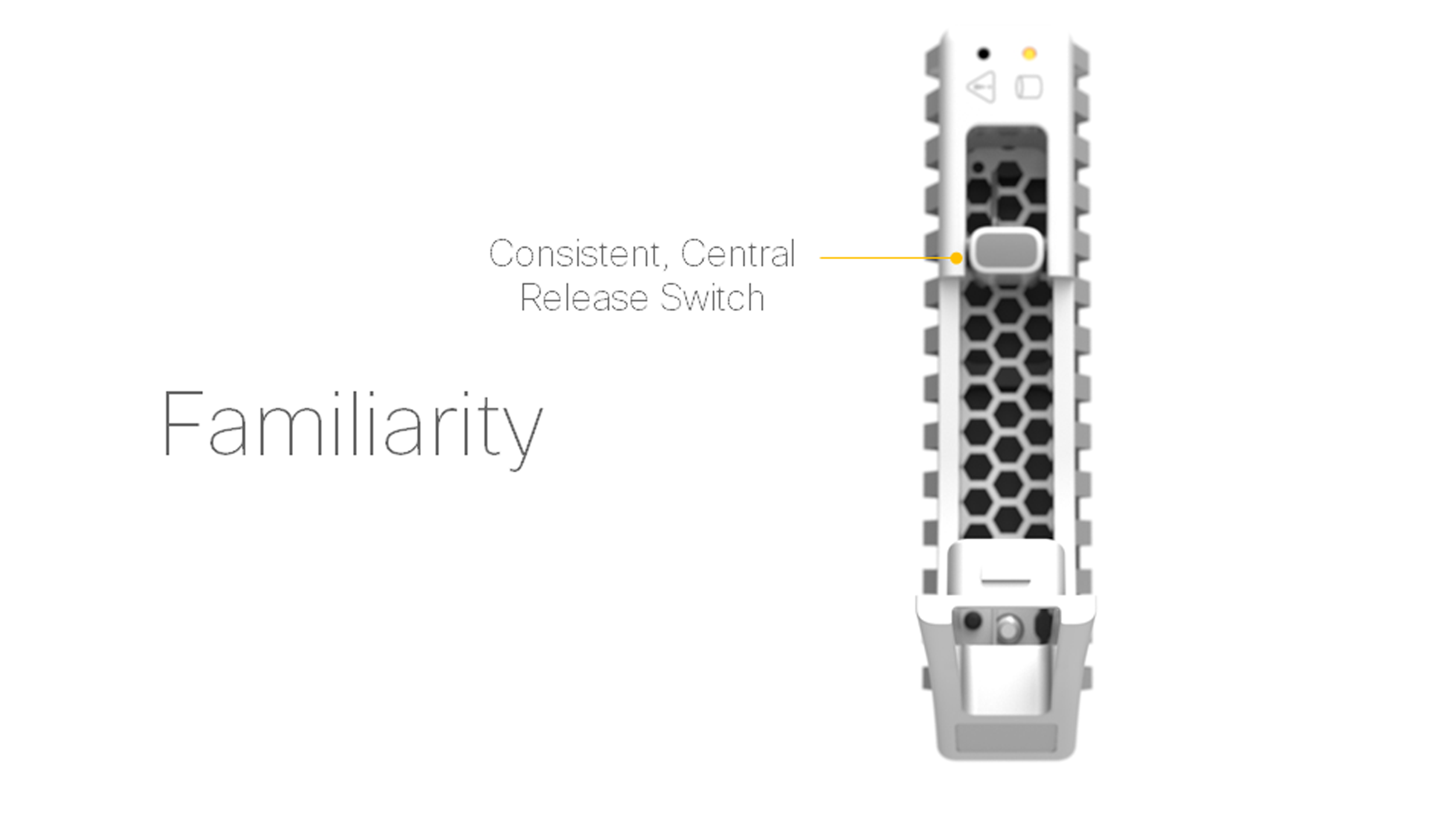
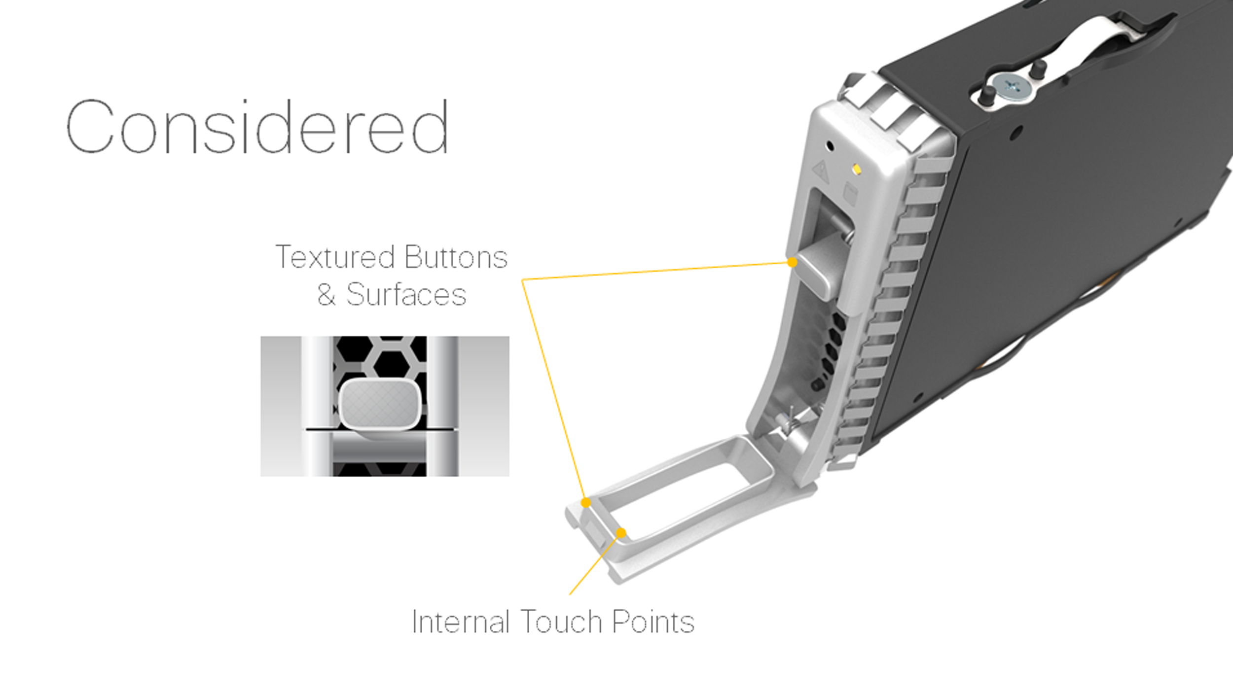
We collaborated closely with technical peers to ensure that all work met mechanical and thermal constraints, as well as human factor requirements.
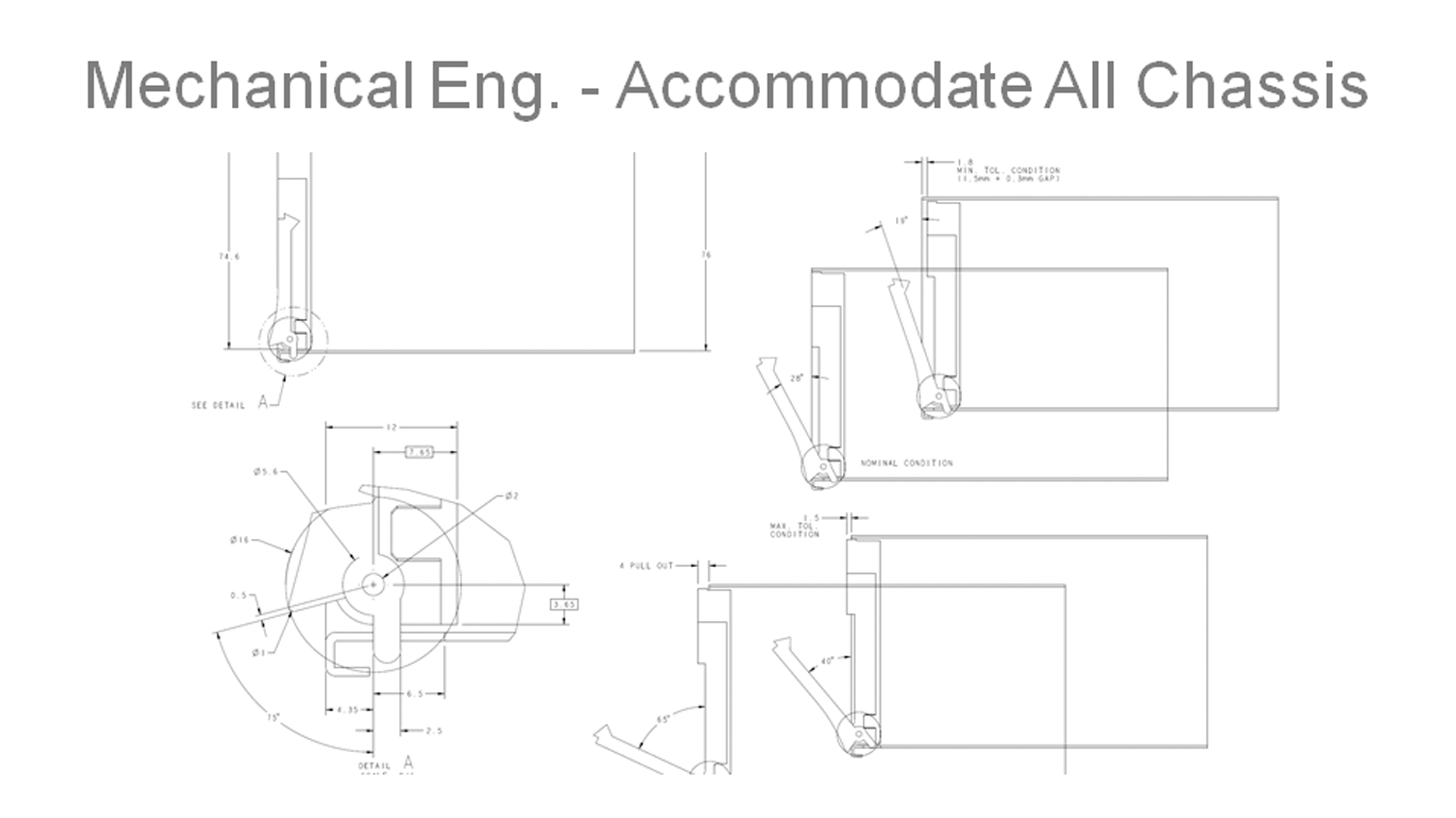
To achieve consistency across multiple SKUs, we developed a standardized ejection design that required meticulous testing and verification of design proposals.
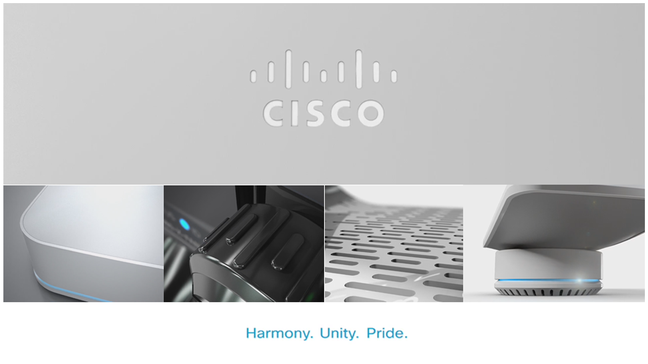
With the concepts vetted, we applied the design values and themes to the next level of components.
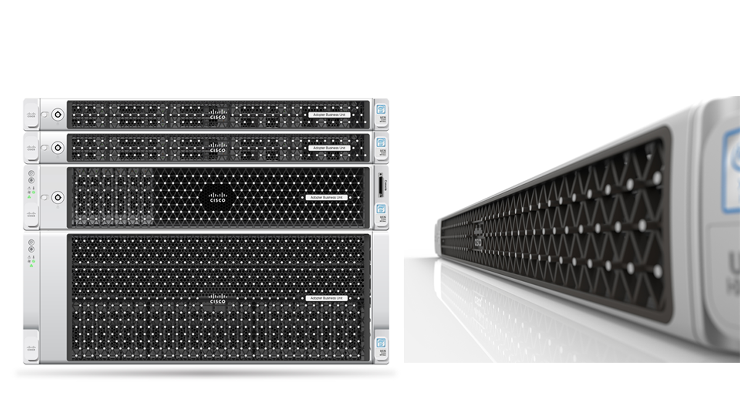
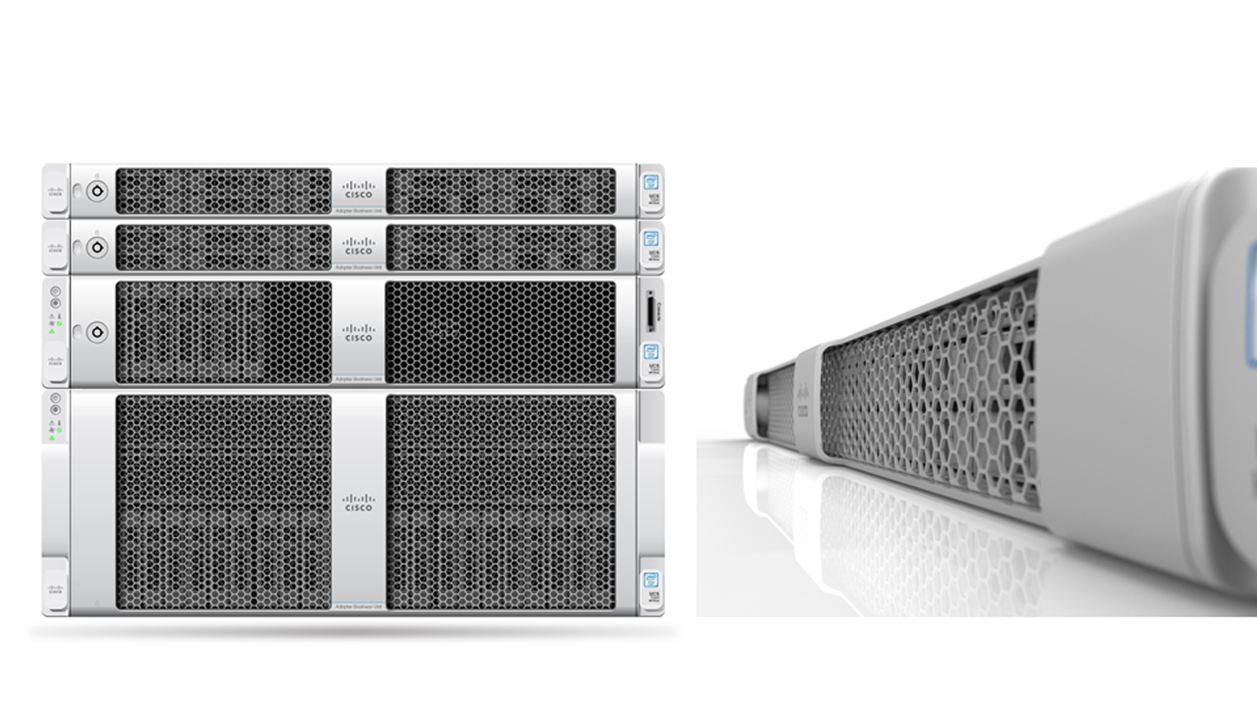
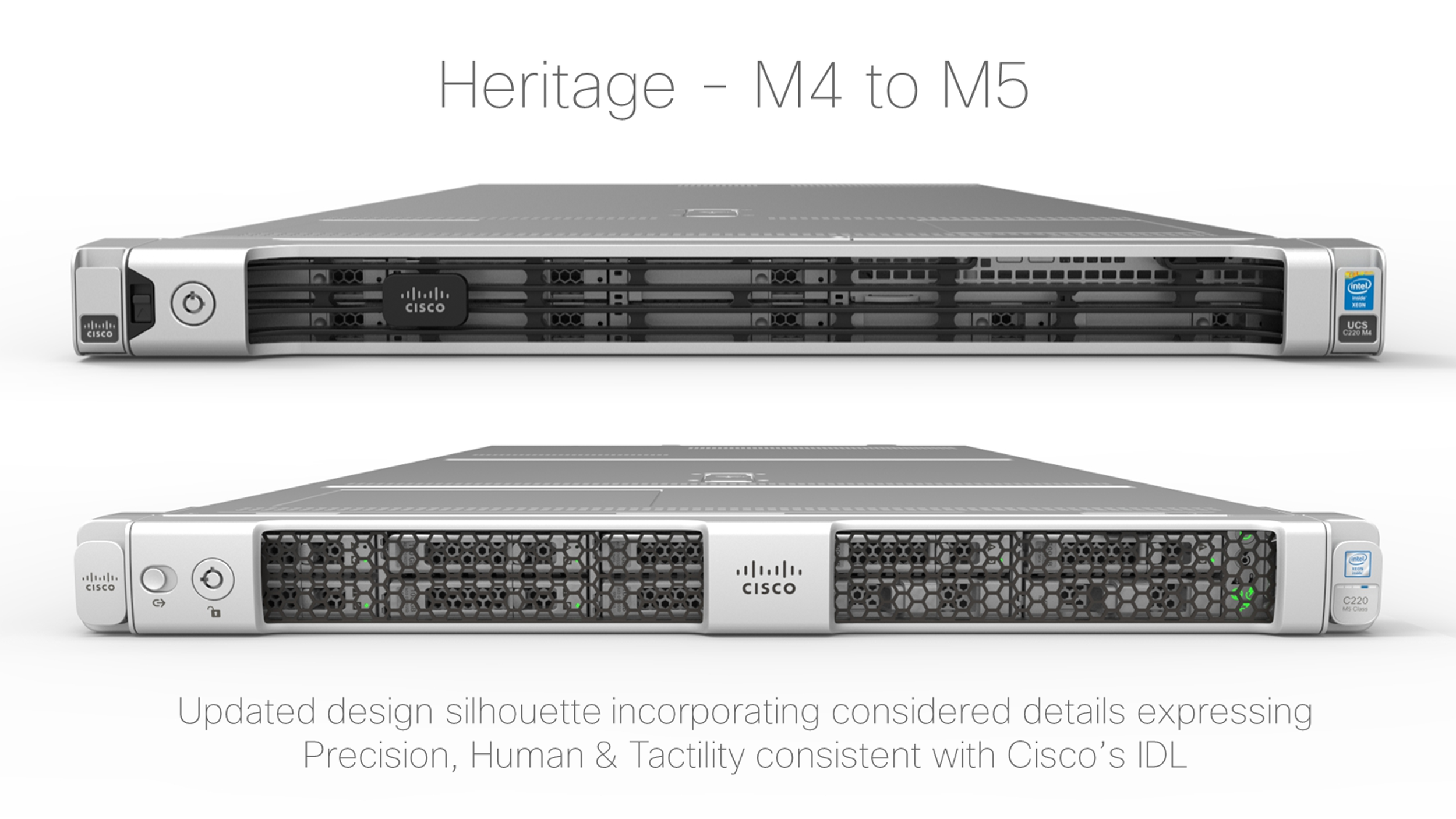
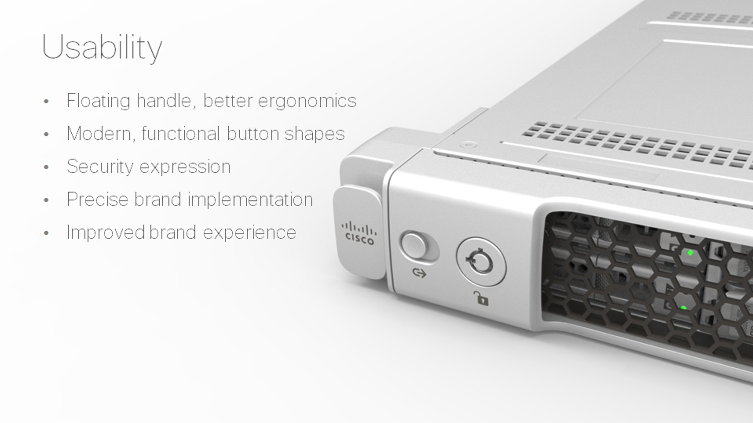
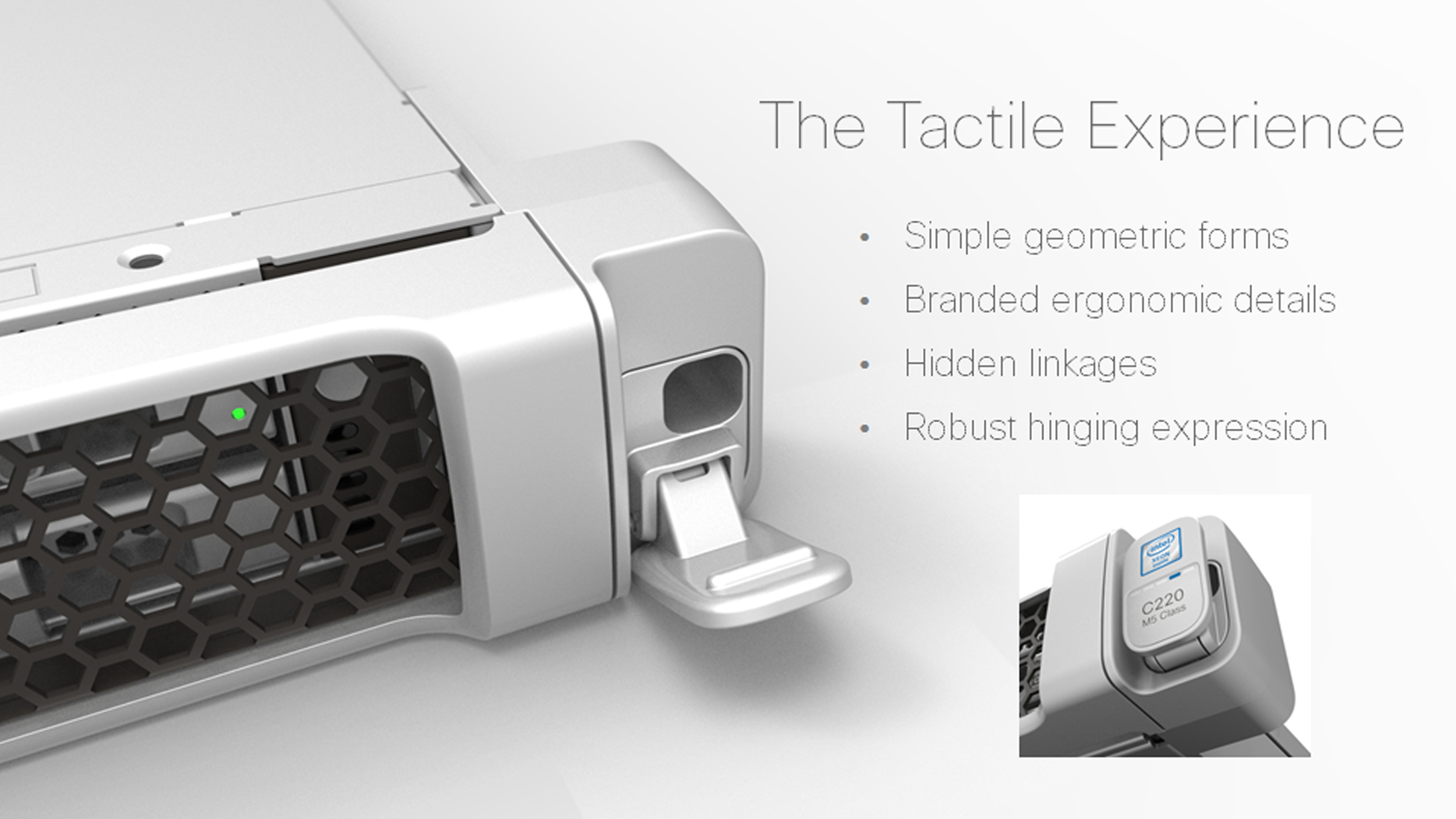
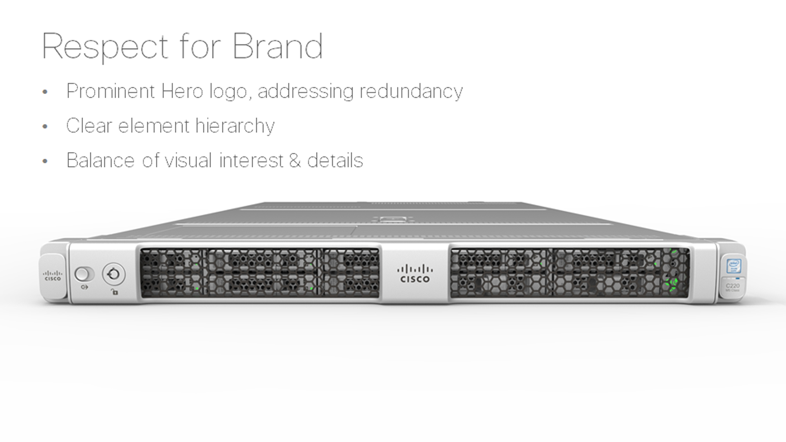
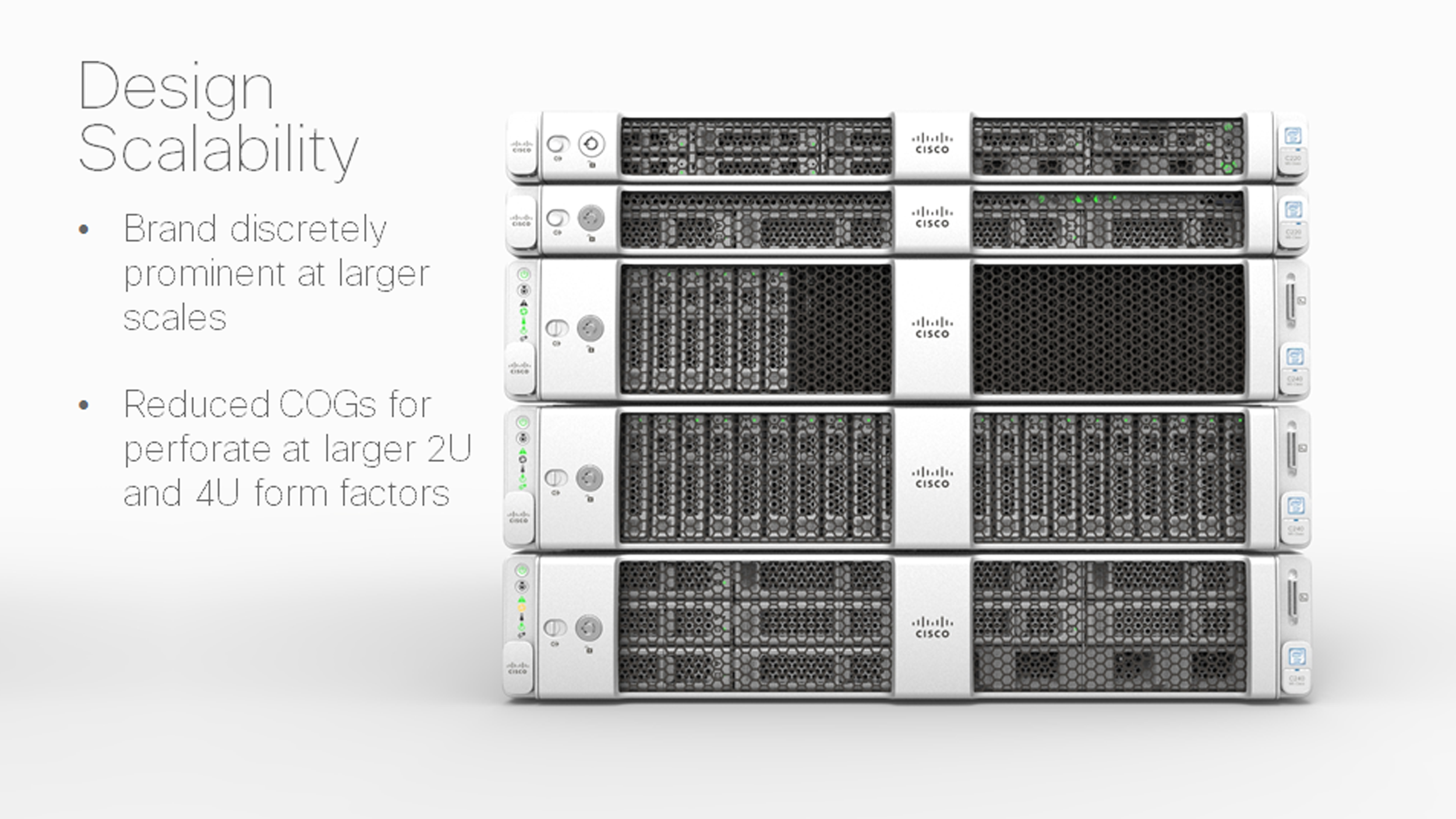
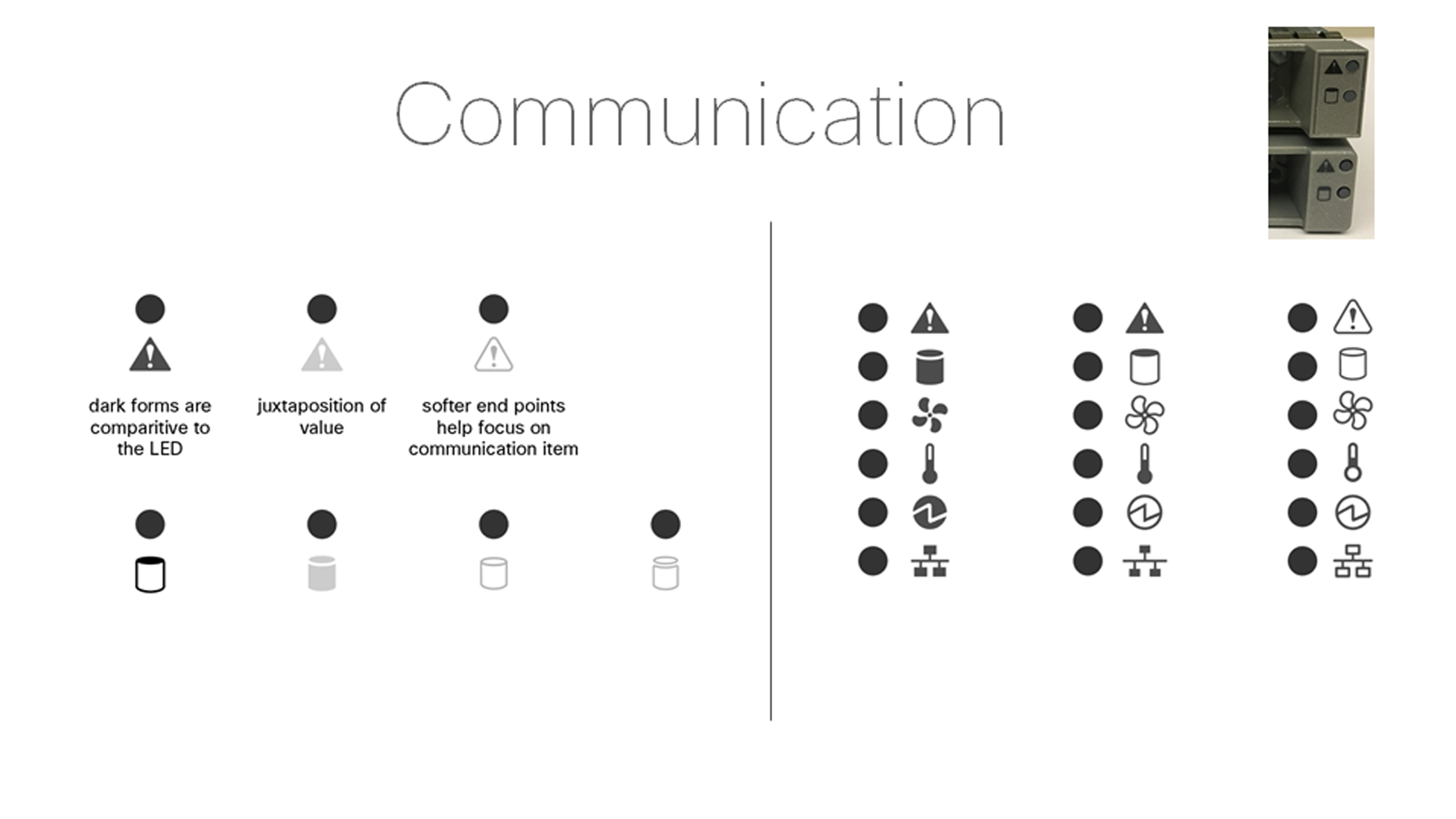

To achieve a seamless product rollout, we developed icons that could be used globally and tested them across business units to prevent any potential miscommunication.
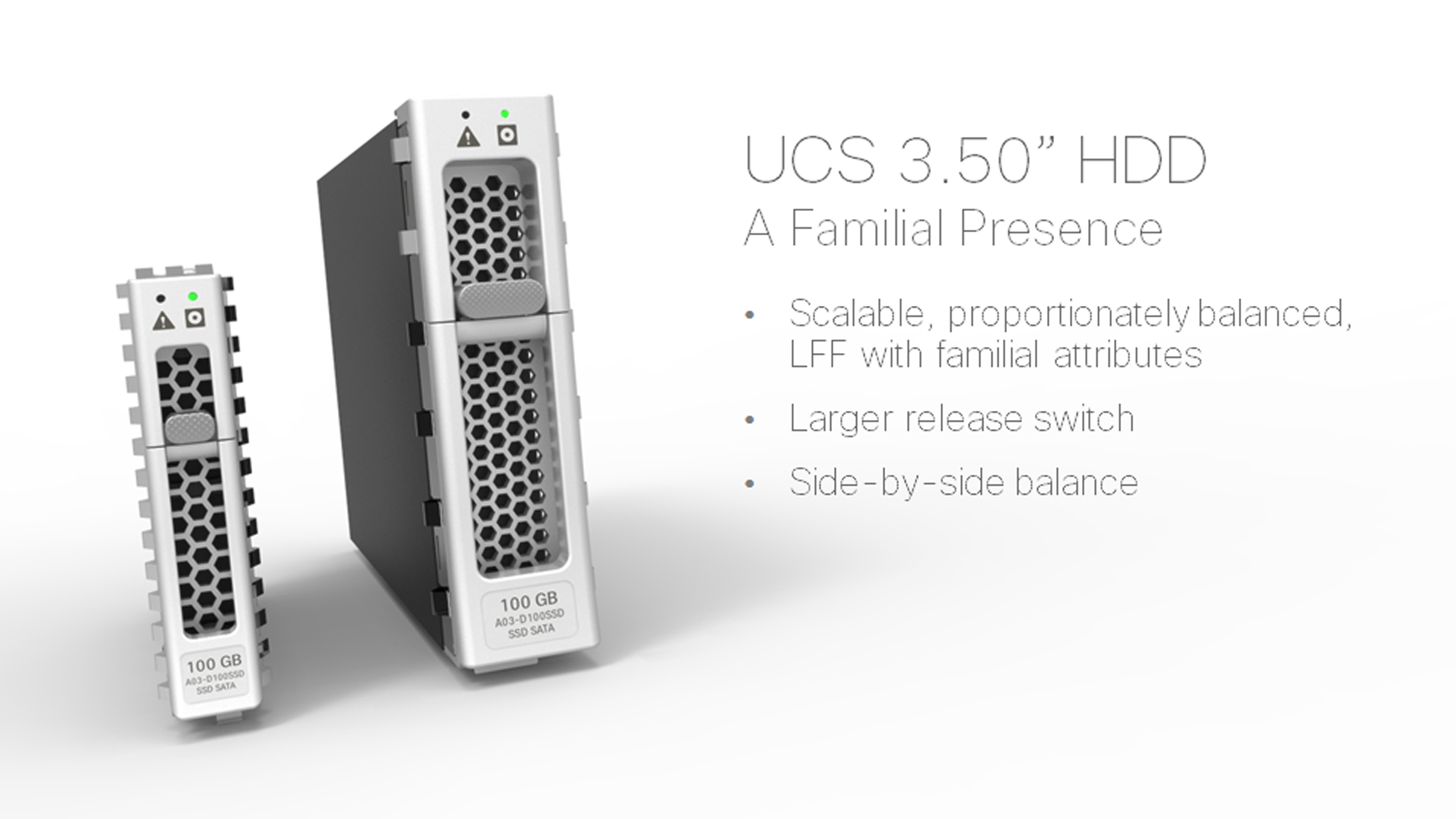
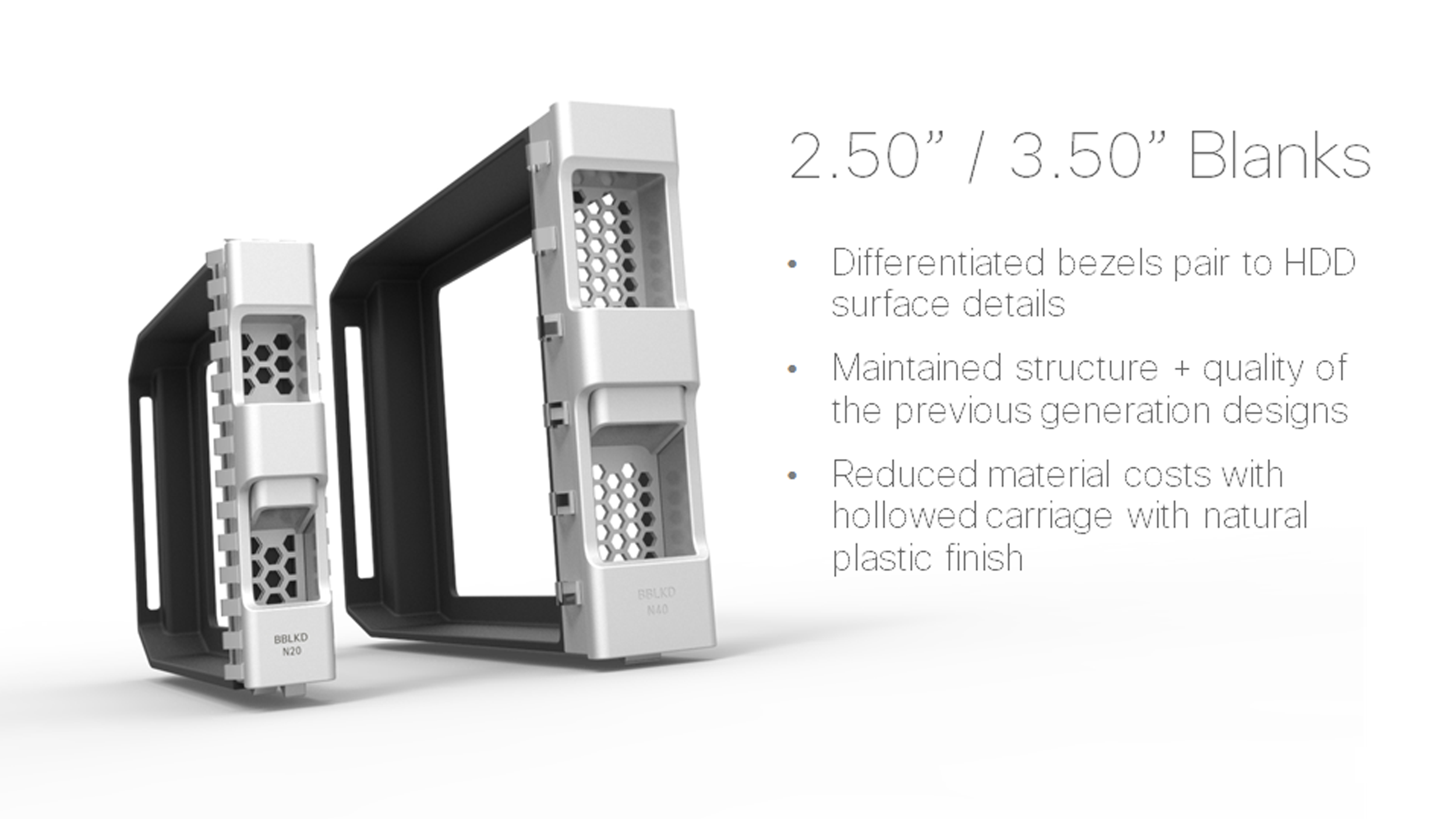
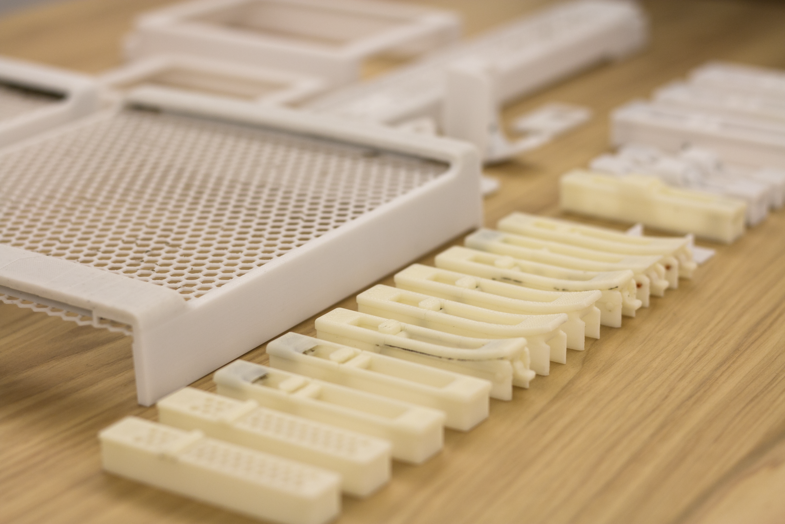
Iterative mock-ups were utilized to validate both the form and concept.
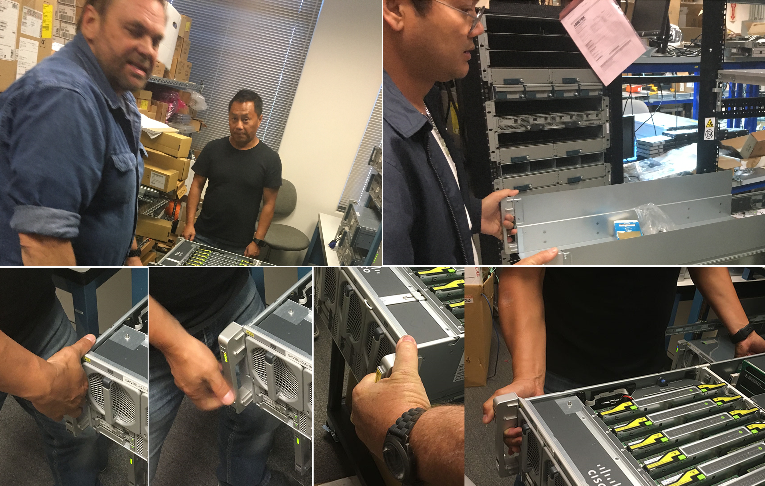
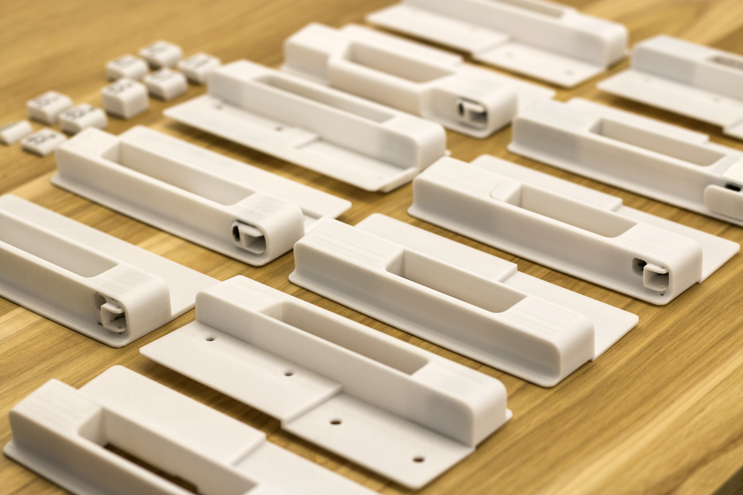
Usability and ergonomic mock-ups were utilized to validate use cases and ensure optimal ergonomics for installers handling the heaviest chassis on a rack.
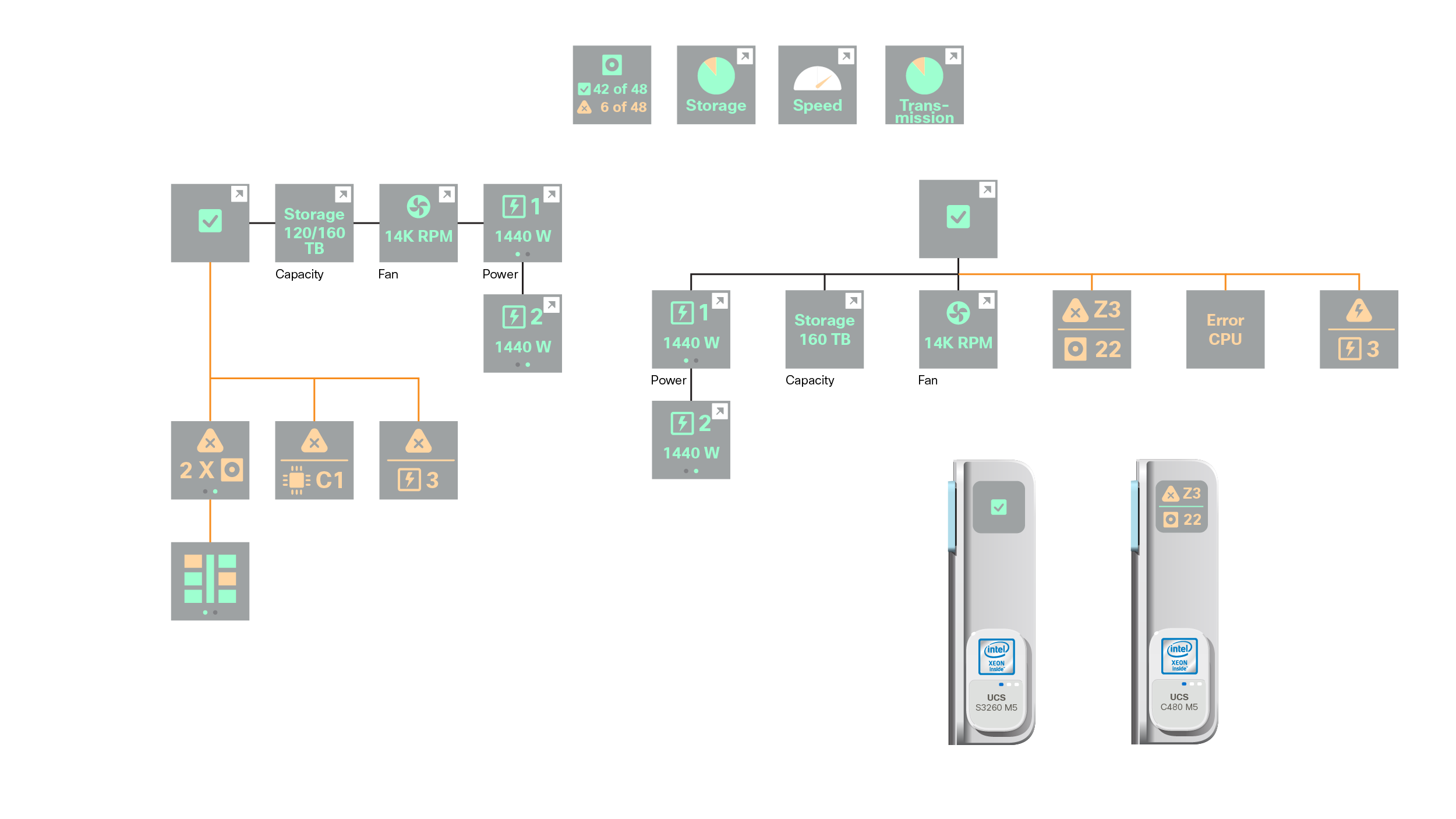
To support future scalability and expansion of the product line, we developed an iconographic warning and input system accessed via a touch panel.
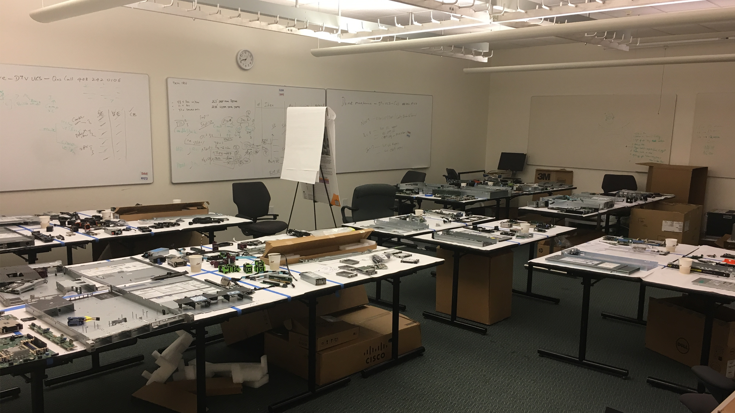
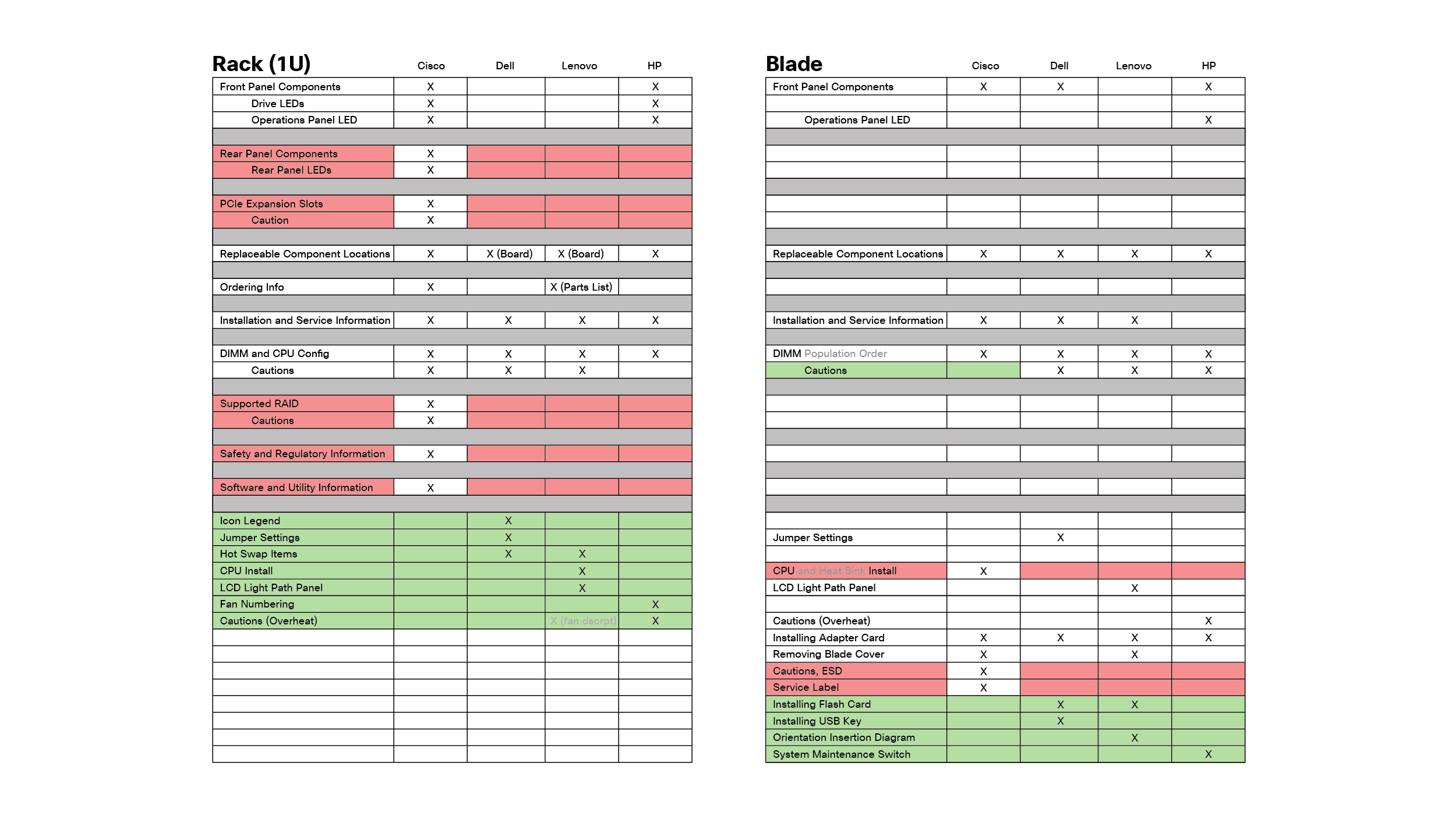
To supplement our quantitative research, we performed teardowns and continuity mapping of competitors, providing us with valuable insights into the market landscape and opportunities for introducing competitive advancements.

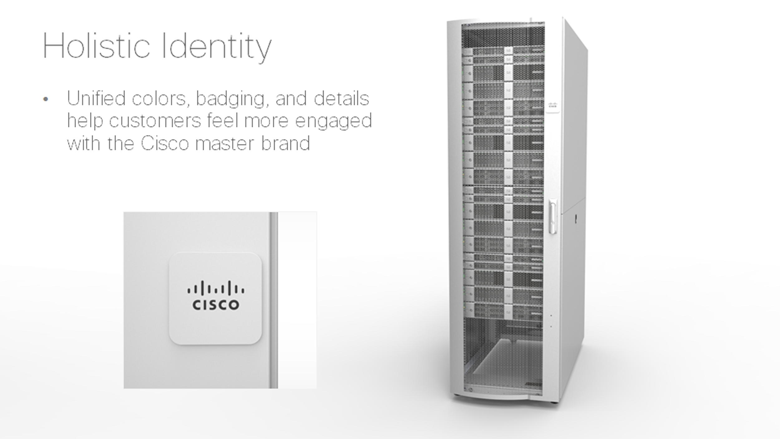
Using corporate ID colors, we established a unified Color/Materials/Finish scheme that was applied across the board. The resulting palette not only elevated the design and usability of the product, but also helped reduce printing costs and related challenges.
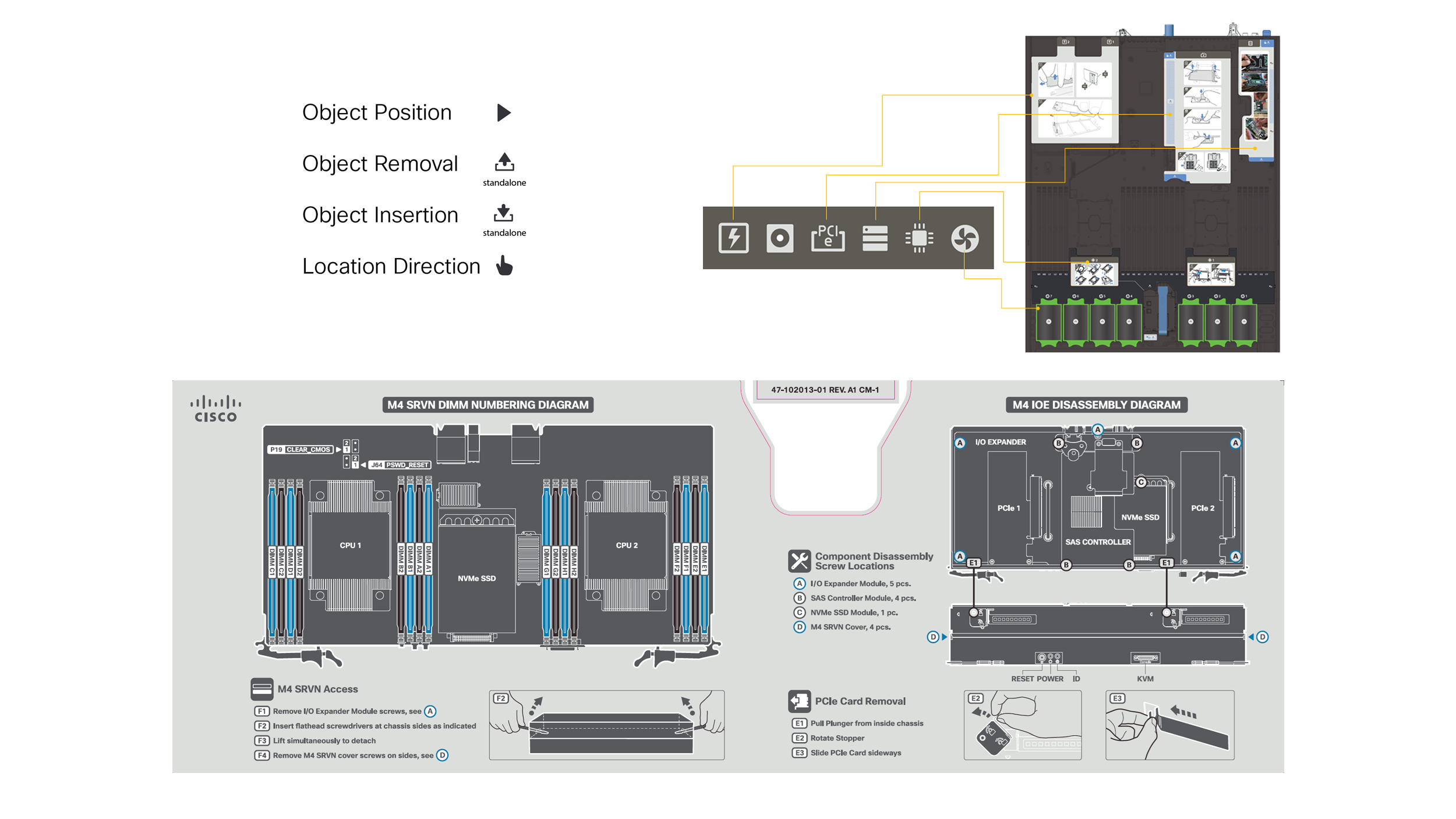
With the creation of consistent illustration treatments and design principles, our work was easily implemented at scale. As a result, it was able to be used upstream and applied throughout various business units.
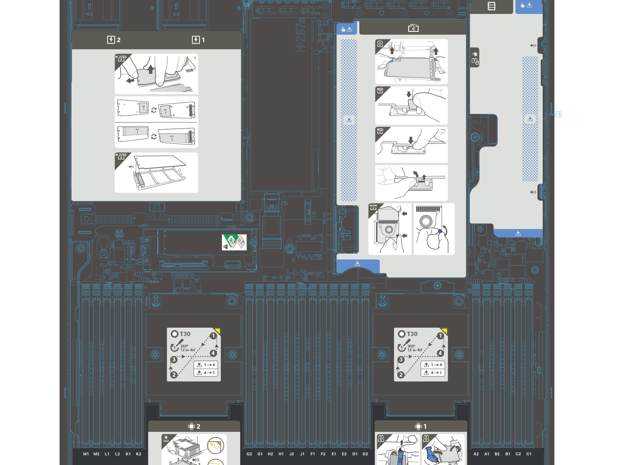
In addition, constant communication with other business units allowed us to create a company-wide pictorial installation and identity system that communicated effectively for Cisco’s global market.
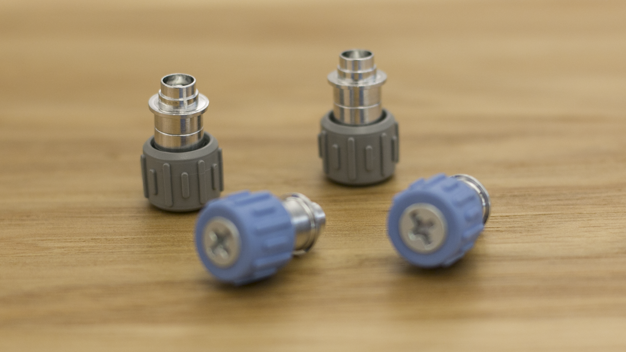
We elevated the impact of branded touch points by adding functional colors to them.
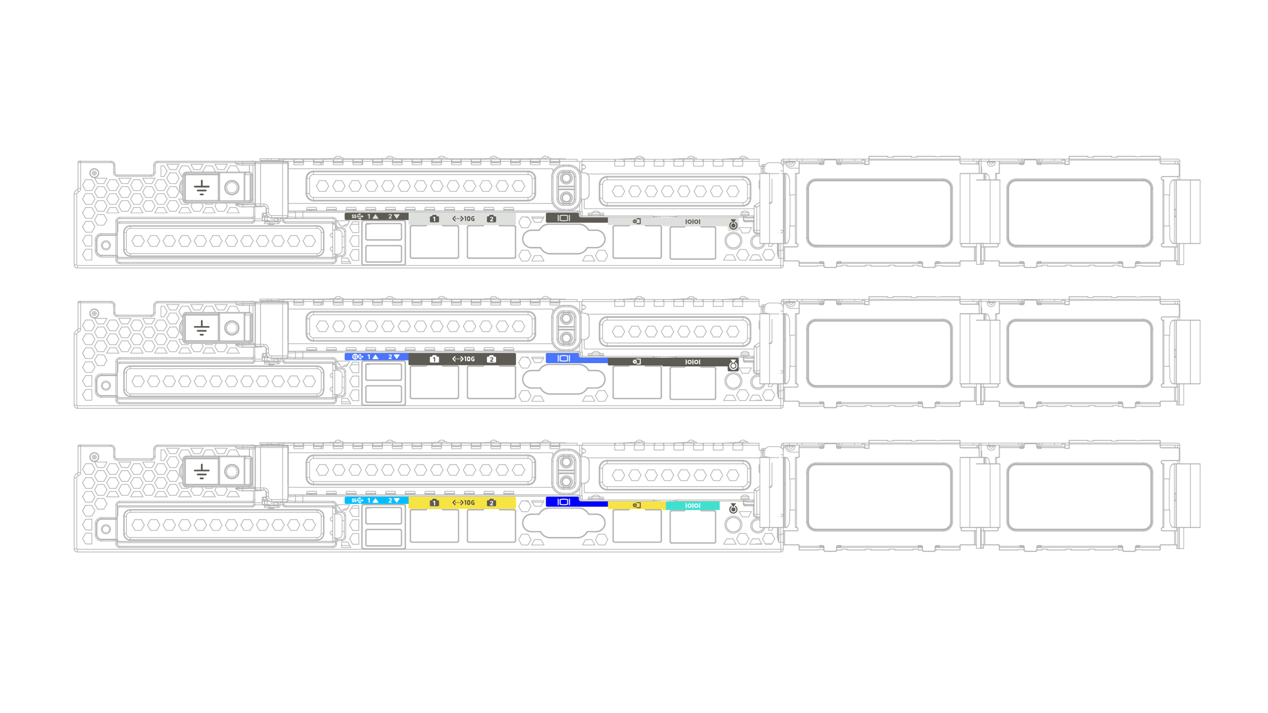
To maintain a clean and simple appearance within a limited space, we explored simplified color palettes, allowing important details to stand out without cluttering the design.

Working closely with paint vendors, I approved swatches and second source vendors for multiple production processes across global locations. By utilizing lead time diagrams, I was able to flag, communicate and resolve potential issues before they became critical.
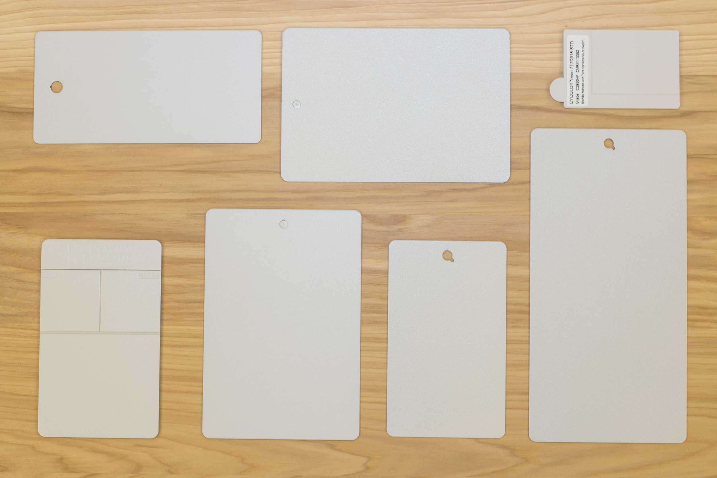
Working alongside vendors, we approved the appropriate swatches and utilized second sourcing to ensure color consistency across multiple materials, unifying CMF throughout the entire Cisco company-wide portfolio.

Through our evaluation of different metal bonding finishes, we refined the preferred appearance to select the appropriate manufacturing process for production at scale.
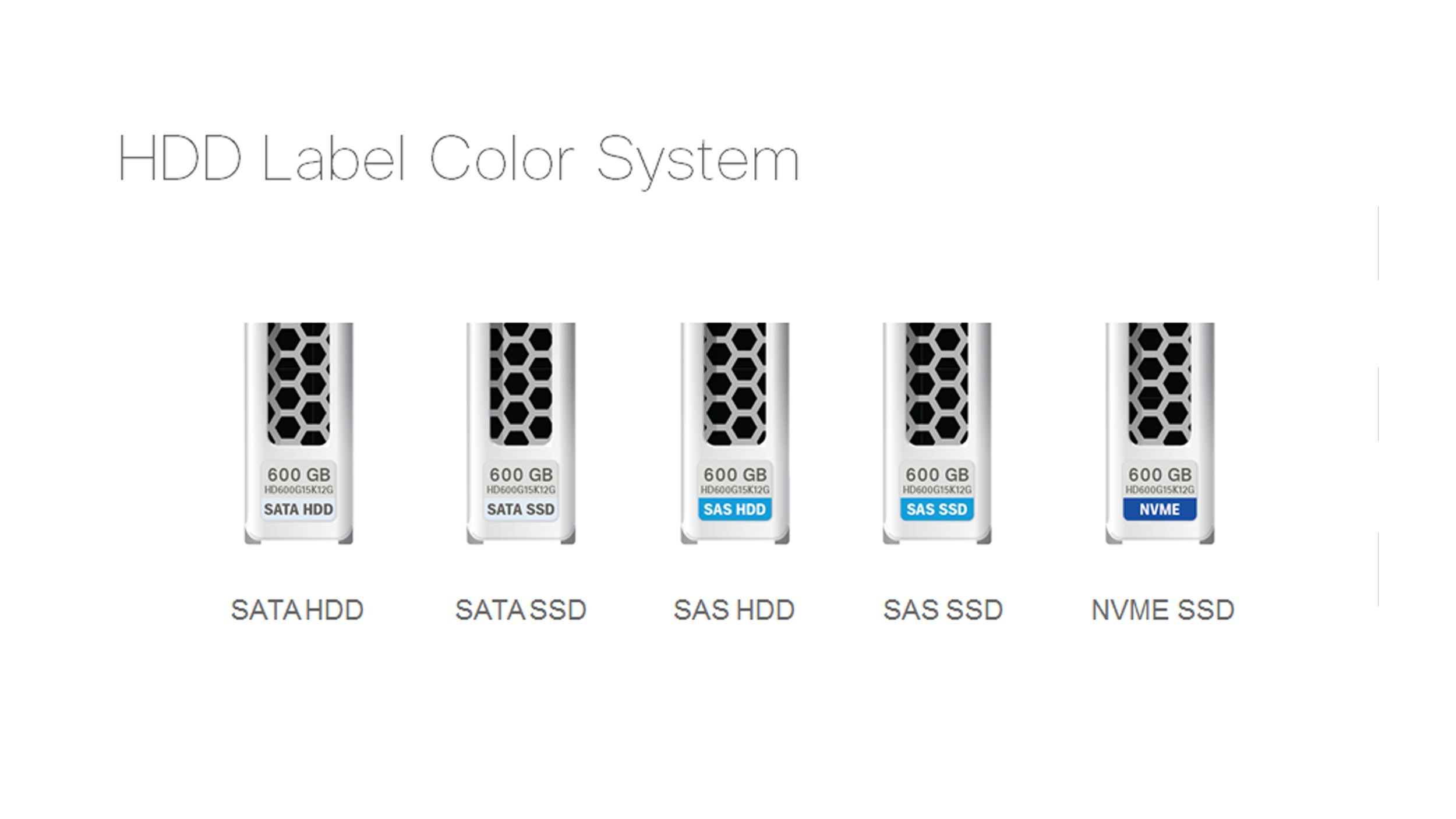
Assembly of this system was performed in several stages (L6-L10), and its intricate storage drive system required precise placement within specific chassis. Therefore, it was essential to develop a functional system that did not impede assembly times or customer usability.
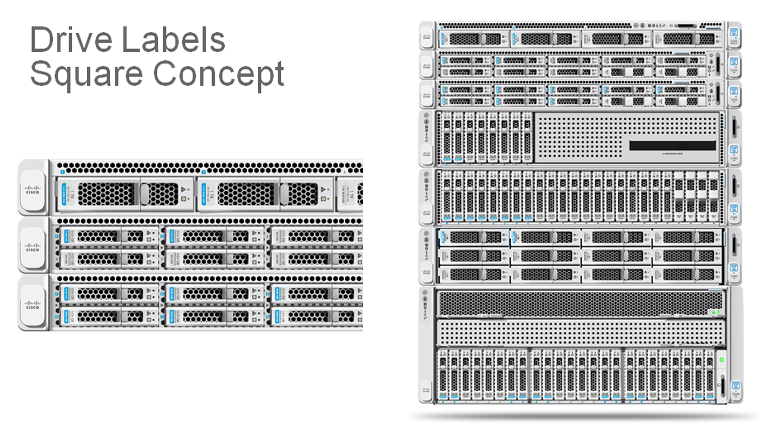
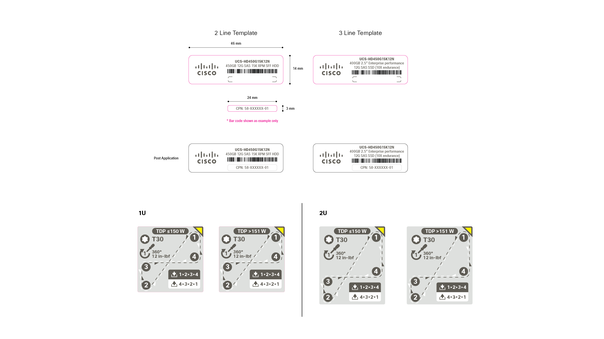
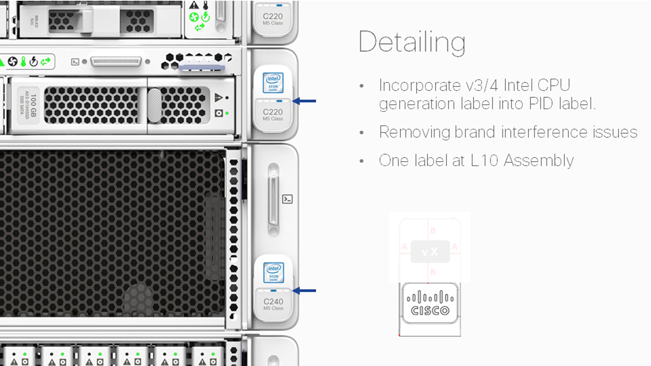
In collaboration with print vendors, we developed component labels with clear instructions for ordering modularized parts and directing users to relevant online documentation.

By selecting labels with optimal appearance and durability for both silkscreen and print-on-demand options, we established a system that minimized assembly errors and enabled seamless customer upgrades.
